KNIME
KNIME
KNIME
Getting Started: KNIME
Our KNIME Primer for Finance and Audit Teams
1. Introducing the KNIME Analytics Platform
Who this guide is for
Finance and audit teams who are:
– Still using large, fragile spreadsheets for recurring tasks
– New to KNIME and want a simple, practical starting pointWhat you’ll be able to do after this guide
– Install KNIME and understand the main screen
– Build a first workflow that replaces a spreadsheet task
– Know where to look for logs, errors, and performance issues
If you’re brand new to KNIME: Do sections 1–4, then jump to 7 to build your first workflow.
If KNIME is already installed: Skim 1, then go to 3, 4 and 7.
The Transition from Spreadsheets to Workflow Automation
If you're still doing monthly reporting in Excel, you already know the problems: formulas break when someone adds a row, version control is a nightmare, and good luck explaining to an auditor exactly how you got from A to B.
KNIME fixes this. It's a free, visual workflow tool that turns your manual spreadsheet processes into documented, repeatable automations. Every step is visible. Every calculation is traceable. And when next month arrives, you press one button instead of rebuilding from scratch.
We've trained hundreds of finance and audit professionals on KNIME. This guide covers what you need to get started.
Figure 1
What is the KNIME Analytics Platform?
The KNIME Analytics Platform is an open-source, visual environment for building data workflows. Instead of writing long scripts or typing endless little commands, you connect nodes, which are small functional blocks that let you prepare data, analyse it, model it, and even deploy it.
In simpler terms: think of KNIME as a canvas where you drag, drop, and connect steps that transform your data from raw to meaningful. It brings together what many people normally do in spreadsheets, SQL, Python, and BI tools, and puts it all in one place in a visual and easy-to-follow workspace.
What it can do:
Read data from almost any source (files, databases, APIs, cloud services).
Clean, reshape, and validate data with no-code or low-code logic.
Build machine learning models and evaluate them.
Automate repetitive data tasks.
Produce reports, dashboards, and services others can reuse.
Why does KNIME matter?
Data work can be messy, scattered, and slow. It often ends up locked inside spreadsheets or scripts that only one person truly understands.KNIME exists to make analytics transparent, repeatable, and shareable for anyone who works with data.
From our training sessions: The audit trail benefit is undersold. When we train internal audit teams, the first "aha moment" is usually when they realise they can show exactly how a number was calculated. Excel hides that logic across cell formulas in multiple tabs. KNIME makes it visible in one workflow.
Key reasons people choose KNIME:
No-code or low-code accessibility: You do not need to be a developer to build powerful workflows. KNIME lets you create solutions visually, step by step.
End-to-end coverage: From data preparation and blending to modelling, reporting, and deployment, everything happens within a single workflow that you can see and understand.
Open and extendable: KNIME connects seamlessly with Python, R, SQL, cloud platforms, and modern machine learning libraries. It works with the tools you already use.
Reusability: Once a workflow is built, it can be run again with new data and the same logic. There is no need to recreate work.
Auditability and trust: Every action is visible, documented, and traceable. This creates confidence in both the process and the results.
Why organisations love it: KNIME reduces manual tasks, lowers the risk of errors, and helps teams share knowledge rather than keeping it hidden inside siloed tools. It brings clarity and structure to data work, which leads to better decisions and more reliable outcomes.
When should you use the KNIME Analytics Platform?
You can think of KNIME as your go-to tool whenever you're fed up wrestling with the same spreadsheet that you are using for semi-automated data processing (like reconciliations) and want to get rid of the errors from all those manual cut and paste and interventions.
Great use cases
When your data comes from several sources and needs to be combined in a reliable way, KNIME becomes a helpful choice. It is also useful when spreadsheets start to grow too large, too slow, or too fragile to manage. If you find yourself repeating the same tasks, such as monthly reporting or routine data preparation, KNIME helps automate these steps. It also provides a clear and transparent flow of logic that you can easily understand or share with others. When you want to explore machine learning without diving into a full coding environment, KNIME offers a practical starting point. And when you need to share experiments, prototypes, or proofs of concept quickly, KNIME makes that process simple and straightforward.
Typical workflow moments
Workflow Stage | How KNIME Helps |
|---|---|
Start of a project | Explore messy or unfamiliar data, test ideas, and build understanding before committing to deeper analysis. |
Daily or weekly cycles | Clean, validate, and distribute information consistently, reducing repeated manual work. |
Advanced analytics | Build predictive models, apply algorithms, evaluate results, and keep everything documented in a clear workflow. |
Operationalisation | Move analytics into production, integrate with enterprise systems, and automate processes for reliable long-term use. |
Where can KNIME be used?
KNIME fits naturally wherever data needs to be understood, cleaned, combined, or transformed. It is not tied to a single industry or a specific type of system. Instead, it adapts to the environment you already work in. Many people begin by installing KNIME on a laptop and using it as their personal analysis space. From there, it scales comfortably into larger ecosystems such as on-premise databases, cloud data warehouses, or secure enterprise platforms. The experience remains consistent, since you build workflows visually regardless of where the data resides.
Across industries, the tasks may vary, but the underlying challenges are often the same. A financial analyst might use KNIME to reconcile ledgers across multiple systems, while a marketer uses it to bring together campaign metrics from several platforms. Manufacturing teams blend sensor readings with quality data. Healthcare teams process clinical records. Retailers explore sales patterns. The subject matter may change, but the need for a clear and repeatable way to work with information stays constant.
KNIME is equally flexible in technical environments. It can read from a simple local file on your machine, but it also connects to cloud storage, enterprise applications, and APIs when the situation calls for it. And when teams need automation or collaboration, workflows can move easily from a local computer to a KNIME Business Hub, where they can run on a schedule, power dashboards, or act as shared tools for the wider organisation. In other words, KNIME works wherever your data lives, whether that is a single spreadsheet or a fully equipped enterprise infrastructure.
Who can use KNIME?
KNIME is designed for anyone who works with data, regardless of skill level. Beginners appreciate its visual, step by step approach, which makes analysis easy to learn and encourages confidence without needing to write code. Tasks that feel familiar in spreadsheets become clear visual actions in a workflow.
Technical users benefit just as much. Data scientists can use Python or R for advanced modeling, while engineers and developers connect KNIME to databases, cloud systems, and APIs. The logic behind every step remains visible and traceable, which keeps solutions maintainable and easy to review.
Teams gain the most from this combination. Because workflows are transparent and reproducible, one person’s work can be understood and trusted by others. This makes KNIME ideal for environments where clarity and accountability matter, such as auditing, regulatory work, and quality assurance.
In short, KNIME is for anyone who needs reliable, transparent, and repeatable data work, from beginners building their first workflows to experts delivering enterprise level solutions.
If you want to explore what else is possible, we recommend visiting the official KNIME website. It is a great way to see the platform’s full capabilities and discover additional resources.
Want help rolling this out to your team?
We run KNIME training specifically for finance and audit teams using your processes, not toy examples. Get in touch to talk about a short pilot or a training cohort.
2. Installing the KNIME Analytics Platform
Before you begin building workflows or exploring data, you will need a working version of the KNIME Analytics Platform on your machine. Fortunately, the installation process is simple, and most users, whether they work in IT, analytics, audit, or business operations, can complete it without assistance. This chapter guides you through the steps in a clear and steady manner, so you know exactly what to expect from the moment you download KNIME to the moment it opens for the first time.
If you’re on a locked-down corporate laptop, you may need IT to install KNIME for you. In that case, send them this section or point them to the KNIME installation page.
Getting KNIME onto your computer is a simple process. You download it, install it, open it, and begin working. This chapter walks you through those steps in a clean, straightforward flow, without assuming any technical background. Follow the steps below:
Go to the KNIME Analytics Platform Download Page. In here, you can register to receive helpful updates and tips, or simply accept the terms and conditions and directly head on to the available installation packages.
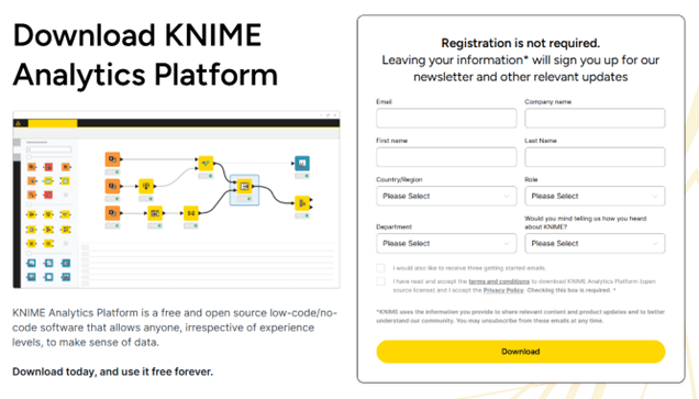
Figure 2.1 — Download Landing Page
Choose the release line that best fits your needs. KNIME provides two options. The Standard Release is updated every 6 weeks and includes the newest features, which makes it a good choice for most users. The Long Term Support Release is updated less often and is ideal for teams that prefer maximum stability. You can find a full explanation of the differences in the release notes FAQ.
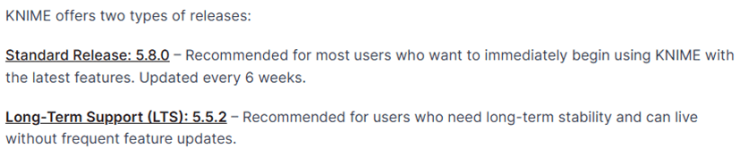
Figure 2.2 — Releases
Scroll down to the section for your operating system (Windows, Linux, macOS).
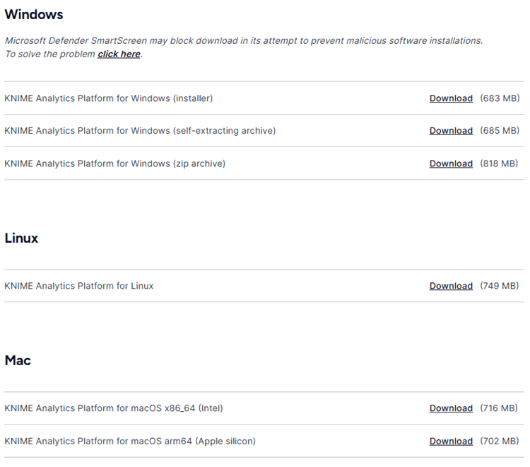
Figure 2.3 — OS Installation Packages
Click the installer type that best fits your needs to start the download:
Windows options:
Installer: Extracts files, adds a desktop icon, and suggests memory settings.
Self-extracting archive: Creates a folder with the installation files, no extra software required.
Zip archive: Can be downloaded and extracted anywhere you have full access rights.
Once the file is on your machine, run the installer.
On Windows, open the .exe file and follow the standard installation prompts.
On macOS, open the .dmg file and drag KNIME into your Applications folder.
On Linux, extract the downloaded archive and place the folder wherever you prefer.
The installation process is routine; most users finish in a couple of minutes.
Launch KNIME from your applications list. The first thing KNIME asks for is a workspace. A workspace is a folder where your workflows and settings will live. You can accept the default option or choose your own. Once selected, KNIME opens and presents a clean canvas ready for your first workflow.
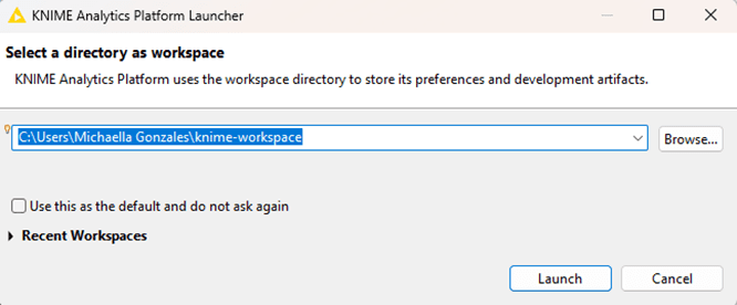
Figure 2.4 — Workspace Preview upon Launch
Advanced Options (You Can Skip This on Day One!)
As your work grows, you may want to add extra capabilities such as Python integration, database tools, machine learning libraries, or cloud connectors. To install these, open the Help menu and select Install Extensions. Choose what you need and KNIME will set it up for you. You can add extensions whenever you like, so there is no need to install everything at the start.
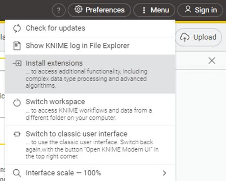
Figure 2.5 — Install Extensions under the Menu option
If you work with large datasets, you may want to increase KNIME’s memory limit. This is done by editing a small configuration file called knime.ini located in the installation directory. Raising the value of the -Xmx setting allows KNIME to use more memory. For many users, this step isn’t necessary at the beginning, but it’s helpful to know where it lives.
With installation complete, you now have a fully capable analytics environment on your machine. You can begin creating workflows, explore sample data, or try rebuilding tasks from your daily work. KNIME is ready as soon as it opens, with no extra setup, no activation, and no hidden steps.
2. Installing the KNIME Analytics Platform
Before you begin building workflows or exploring data, you will need a working version of the KNIME Analytics Platform on your machine. Fortunately, the installation process is simple, and most users, whether they work in IT, analytics, audit, or business operations, can complete it without assistance. This chapter guides you through the steps in a clear and steady manner, so you know exactly what to expect from the moment you download KNIME to the moment it opens for the first time.
If you’re on a locked-down corporate laptop, you may need IT to install KNIME for you. In that case, send them this section or point them to the KNIME installation page.
Getting KNIME onto your computer is a simple process. You download it, install it, open it, and begin working. This chapter walks you through those steps in a clean, straightforward flow, without assuming any technical background. Follow the steps below:
Go to the KNIME Analytics Platform Download Page. In here, you can register to receive helpful updates and tips, or simply accept the terms and conditions and directly head on to the available installation packages.
Figure 2.1 — Download Landing Page
Choose the release line that best fits your needs. KNIME provides two options. The Standard Release is updated every 6 weeks and includes the newest features, which makes it a good choice for most users. The Long Term Support Release is updated less often and is ideal for teams that prefer maximum stability. You can find a full explanation of the differences in the release notes FAQ.
Figure 2.2 — Releases
Scroll down to the section for your operating system (Windows, Linux, macOS).
Figure 2.3 — OS Installation Packages
Click the installer type that best fits your needs to start the download:
Windows options:
Installer: Extracts files, adds a desktop icon, and suggests memory settings.
Self-extracting archive: Creates a folder with the installation files, no extra software required.
Zip archive: Can be downloaded and extracted anywhere you have full access rights.
Once the file is on your machine, run the installer.
On Windows, open the .exe file and follow the standard installation prompts.
On macOS, open the .dmg file and drag KNIME into your Applications folder.
On Linux, extract the downloaded archive and place the folder wherever you prefer.
The installation process is routine; most users finish in a couple of minutes.
Launch KNIME from your applications list. The first thing KNIME asks for is a workspace. A workspace is a folder where your workflows and settings will live. You can accept the default option or choose your own. Once selected, KNIME opens and presents a clean canvas ready for your first workflow.
Figure 2.4 — Workspace Preview upon Launch
Advanced Options (You Can Skip This on Day One!)
As your work grows, you may want to add extra capabilities such as Python integration, database tools, machine learning libraries, or cloud connectors. To install these, open the Help menu and select Install Extensions. Choose what you need and KNIME will set it up for you. You can add extensions whenever you like, so there is no need to install everything at the start.
Figure 2.5 — Install Extensions under the Menu option
If you work with large datasets, you may want to increase KNIME’s memory limit. This is done by editing a small configuration file called knime.ini located in the installation directory. Raising the value of the -Xmx setting allows KNIME to use more memory. For many users, this step isn’t necessary at the beginning, but it’s helpful to know where it lives.
With installation complete, you now have a fully capable analytics environment on your machine. You can begin creating workflows, explore sample data, or try rebuilding tasks from your daily work. KNIME is ready as soon as it opens, with no extra setup, no activation, and no hidden steps.
3. A Quick Tour of the KNIME Interface
Once KNIME is installed and opened, the first thing you see is the user interface, often called the UI. It is the main workspace where you build workflows, inspect data, and interact with every part of the platform. Even if you are new to KNIME, the layout is easy to learn because each area of the screen has a clear purpose.
This chapter introduces the major parts of the interface so that you know exactly what you are looking at when you begin working.
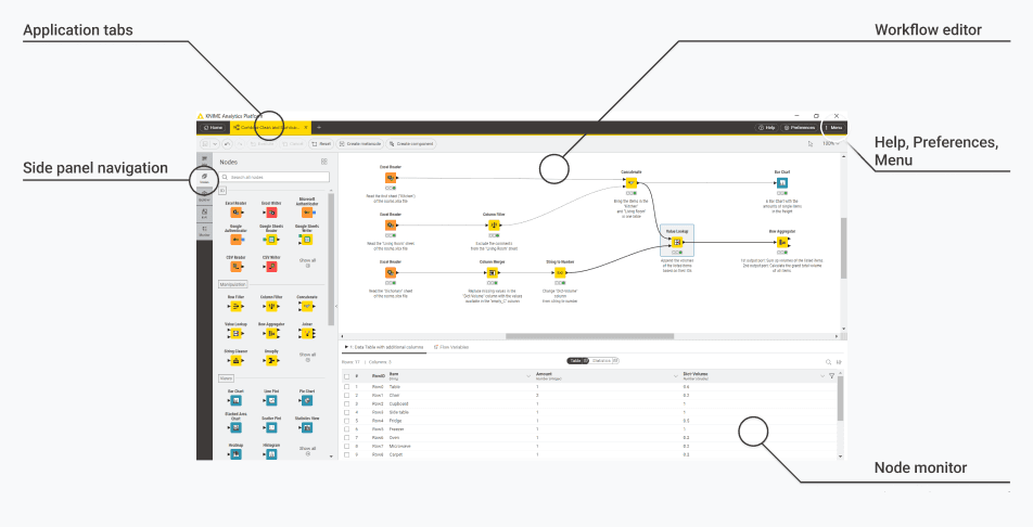
Figure 3.1 — KNIME Modern UI General Layout - application tabs, side panel, workflow editor and node monitor
Application Tabs
The row of tabs at the top of the window. Each tab represents either the entry page or an open workflow. It helps you move between multiple workflows without losing your place. Just like switching between browser tabs, you can jump from one workflow to another instantly. Click a tab to bring that workflow into focus. Close tabs when you are finished. This makes it easy to compare workflows side by side or keep reference workflows open while working on a new one.
Side Panel Navigation
The left side of the screen is your central navigation hub. It contains multiple panels that help you explore nodes, understand workflows, and manage files. It helps you understand what the workflow or component contains, what it is meant to do, and any documentation provided. It contains additional tabs for:
Description (Info) A panel that shows information about the currently selected workflow or component. It helps you understand what the workflow or component contains, what it is meant to do, and any documentation the creator has provided.
Node Repository (Nodes) - A list of all available nodes in the KNIME Analytics Platform. This is where you pick the building blocks for your workflow. Each node represents a specific task such as filtering data, reading a file, training a model, or writing to a database.
Space Explorer (Explorer) - A file browser that lets you navigate your KNIME Hub spaces or your local KNIME workspaces. It helps you open, organize, and manage workflows, components, data files, and KNIME Hub content in one place.
Workflow Monitor (Monitor) - A panel that keeps track of the health of your workflow. It helps you see which nodes have errors or warnings. This is especially useful when debugging a workflow or trying to find the step where something went wrong.
Note: K-AI is the AI assistant built into KNIME Analytics Platform. It serves two primary roles: first as a conversational assistant (Q&A mode) and second as a workflow-building partner (Build mode). You don’t need K-AI to follow this guide; we’ll build everything manually so you understand what’s happening.
Workflow Editor
The large central canvas where your workflow is built. It displays your nodes and the connections between them. This is where you design, structure, and execute your entire analytical process.
Help, Preferences, and Menu
A set of menus located at the upper-right area of the interface. It gives you access to help resources, extension installation, application preferences, themes, update settings, and configuration options.
Node Monitor
A panel that displays the output of the currently selected node. It lets you see what your data looks like at each step. You can inspect tables, check flow variable values, and review intermediate results without opening full data views.
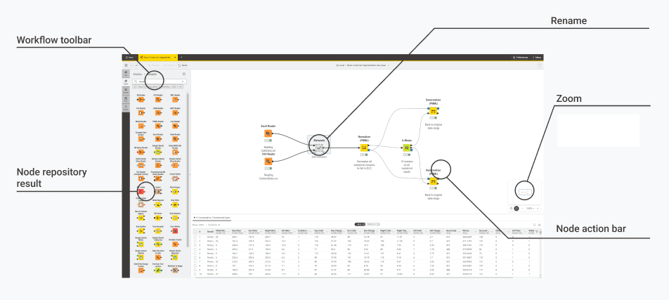
Figure 3.2 — User interface elements — workflow toolbar, node action bar, rename components and metanodes
Workflow Toolbar
A compact toolbar at the top-left area of the workflow canvas. It provides quick access to common workflow actions. This includes saving, undoing, redoing, and other commands that apply to the workflow as a whole or to the node you have selected.
Node Repository Result
A filtered list of nodes shown inside the Side Panel after you search in the Node Repository. It displays only the nodes that match your search term or the categories you selected. This makes it much easier to find exactly what you need without scrolling through the entire repository.
Rename
A feature that allows you to rename metanodes and components directly on the workflow canvas. It helps you keep your workflow clean and understandable. Naming larger structures is important because it shows others what the node contains and what role it plays in your process.
Zoom Controls
A set of controls that allow you to zoom in, zoom out, or fit the workflow to your screen. Zooming helps you navigate both large and small workflows. It allows you to move from high-level overviews to detailed node-level adjustments without losing your place.
Node Action Bar
A contextual bar that appears next to a selected node. It gives you direct access to node-specific actions such as configuring the node, executing it, resetting it, or opening its view.
Try it now: Open KNIME, create a new empty workflow, click a node in the Node Repository and drag it on to the canvas. Watch how the Node Monitor updates when you select different nodes.
3. A Quick Tour of the KNIME Interface
Once KNIME is installed and opened, the first thing you see is the user interface, often called the UI. It is the main workspace where you build workflows, inspect data, and interact with every part of the platform. Even if you are new to KNIME, the layout is easy to learn because each area of the screen has a clear purpose.
This chapter introduces the major parts of the interface so that you know exactly what you are looking at when you begin working.
Figure 3.1 — KNIME Modern UI General Layout - application tabs, side panel, workflow editor and node monitor
Application Tabs
The row of tabs at the top of the window. Each tab represents either the entry page or an open workflow. It helps you move between multiple workflows without losing your place. Just like switching between browser tabs, you can jump from one workflow to another instantly. Click a tab to bring that workflow into focus. Close tabs when you are finished. This makes it easy to compare workflows side by side or keep reference workflows open while working on a new one.
Side Panel Navigation
The left side of the screen is your central navigation hub. It contains multiple panels that help you explore nodes, understand workflows, and manage files. It helps you understand what the workflow or component contains, what it is meant to do, and any documentation provided. It contains additional tabs for:
Description (Info) A panel that shows information about the currently selected workflow or component. It helps you understand what the workflow or component contains, what it is meant to do, and any documentation the creator has provided.
Node Repository (Nodes) - A list of all available nodes in the KNIME Analytics Platform. This is where you pick the building blocks for your workflow. Each node represents a specific task such as filtering data, reading a file, training a model, or writing to a database.
Space Explorer (Explorer) - A file browser that lets you navigate your KNIME Hub spaces or your local KNIME workspaces. It helps you open, organize, and manage workflows, components, data files, and KNIME Hub content in one place.
Workflow Monitor (Monitor) - A panel that keeps track of the health of your workflow. It helps you see which nodes have errors or warnings. This is especially useful when debugging a workflow or trying to find the step where something went wrong.
Note: K-AI is the AI assistant built into KNIME Analytics Platform. It serves two primary roles: first as a conversational assistant (Q&A mode) and second as a workflow-building partner (Build mode). You don’t need K-AI to follow this guide; we’ll build everything manually so you understand what’s happening.
Workflow Editor
The large central canvas where your workflow is built. It displays your nodes and the connections between them. This is where you design, structure, and execute your entire analytical process.
Help, Preferences, and Menu
A set of menus located at the upper-right area of the interface. It gives you access to help resources, extension installation, application preferences, themes, update settings, and configuration options.
Node Monitor
A panel that displays the output of the currently selected node. It lets you see what your data looks like at each step. You can inspect tables, check flow variable values, and review intermediate results without opening full data views.
Figure 3.2 — User interface elements — workflow toolbar, node action bar, rename components and metanodes
Workflow Toolbar
A compact toolbar at the top-left area of the workflow canvas. It provides quick access to common workflow actions. This includes saving, undoing, redoing, and other commands that apply to the workflow as a whole or to the node you have selected.
Node Repository Result
A filtered list of nodes shown inside the Side Panel after you search in the Node Repository. It displays only the nodes that match your search term or the categories you selected. This makes it much easier to find exactly what you need without scrolling through the entire repository.
Rename
A feature that allows you to rename metanodes and components directly on the workflow canvas. It helps you keep your workflow clean and understandable. Naming larger structures is important because it shows others what the node contains and what role it plays in your process.
Zoom Controls
A set of controls that allow you to zoom in, zoom out, or fit the workflow to your screen. Zooming helps you navigate both large and small workflows. It allows you to move from high-level overviews to detailed node-level adjustments without losing your place.
Node Action Bar
A contextual bar that appears next to a selected node. It gives you direct access to node-specific actions such as configuring the node, executing it, resetting it, or opening its view.
Try it now: Open KNIME, create a new empty workflow, click a node in the Node Repository and drag it on to the canvas. Watch how the Node Monitor updates when you select different nodes.
4. The Workflow Editor: Your Main Canvas
The Workflow Editor is your digital workbench. It is the central canvas where financial data transformation comes to life through visual programming. Unlike Excel where logic hides inside cell formulas, the Workflow Editor displays every step of your analysis process as a connected flow of nodes, making your methodology transparent, auditable, and reproducible.
When you create or open a workflow, the Workflow Editor occupies the large central area of the KNIME interface. This blank canvas is where you'll drag nodes from the Node Repository, configure them for your specific financial tasks, and connect them to create automated data processing pipelines. The canvas provides an infinite workspace that automatically expands as you add more nodes, allowing you to build workflows of any size and complexity.
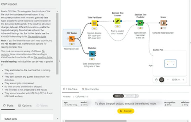
Figure 4.1 — Workflow Editor elements — node description panel, workflow canvas, port outputs, and node execution
Panning Across the Canvas
To move around your workflow, simply click and hold on any empty area of the canvas, then drag in any direction. This works just like moving a map around on your screen. Your mouse cursor changes to a hand icon when you're in panning mode, giving you visual feedback that you're moving the view rather than selecting nodes. This becomes particularly useful when building comprehensive financial processes that extend beyond your visible screen area.
Zooming In and Out
The Zoom Controls appear in the bottom-right corner of the Workflow Editor. Click the plus (+) button to zoom in for detailed work, or the minus (−) button to zoom out to see your entire workflow. You can also use your mouse scroll wheel to scroll up to zoom in, scroll down to zoom out. The "Fit to Screen" button (usually represented by a rectangle icon) automatically adjusts the zoom level so your entire workflow fits in the visible area.
For keyboard users, Ctrl+0 (Windows/Linux) or Cmd+0 (macOS) instantly fits your entire workflow to the screen. This is especially helpful before presenting your workflow to managers or auditors, giving them a complete overview in one glance.
4. The Workflow Editor: Your Main Canvas
The Workflow Editor is your digital workbench. It is the central canvas where financial data transformation comes to life through visual programming. Unlike Excel where logic hides inside cell formulas, the Workflow Editor displays every step of your analysis process as a connected flow of nodes, making your methodology transparent, auditable, and reproducible.
When you create or open a workflow, the Workflow Editor occupies the large central area of the KNIME interface. This blank canvas is where you'll drag nodes from the Node Repository, configure them for your specific financial tasks, and connect them to create automated data processing pipelines. The canvas provides an infinite workspace that automatically expands as you add more nodes, allowing you to build workflows of any size and complexity.
Figure 4.1 — Workflow Editor elements — node description panel, workflow canvas, port outputs, and node execution
Panning Across the Canvas
To move around your workflow, simply click and hold on any empty area of the canvas, then drag in any direction. This works just like moving a map around on your screen. Your mouse cursor changes to a hand icon when you're in panning mode, giving you visual feedback that you're moving the view rather than selecting nodes. This becomes particularly useful when building comprehensive financial processes that extend beyond your visible screen area.
Zooming In and Out
The Zoom Controls appear in the bottom-right corner of the Workflow Editor. Click the plus (+) button to zoom in for detailed work, or the minus (−) button to zoom out to see your entire workflow. You can also use your mouse scroll wheel to scroll up to zoom in, scroll down to zoom out. The "Fit to Screen" button (usually represented by a rectangle icon) automatically adjusts the zoom level so your entire workflow fits in the visible area.
For keyboard users, Ctrl+0 (Windows/Linux) or Cmd+0 (macOS) instantly fits your entire workflow to the screen. This is especially helpful before presenting your workflow to managers or auditors, giving them a complete overview in one glance.
5. All About Nodes
Selecting Nodes
Click any individual node to select it and you'll see it highlighted with a blue border and selection handles (small squares) at its corners. To select multiple nodes, click on empty canvas space and drag to create a selection rectangle. All nodes within or touching this rectangle become selected. Alternatively, hold Ctrl (Windows/Linux) or Cmd (macOS) while clicking individual nodes to add them to your selection one at a time.
Once multiple nodes are selected, you can drag them as a group to reorganize your workflow layout. The connections between nodes automatically adjust to maintain proper links as you move things around.
Understanding Node Anatomy and Structure
Every node in KNIME follows a consistent visual design that communicates its purpose, status, and connectivity at a glance.
The Node Body

Figure 4.2 - Anatomy of a node
Each node appears as a coloured rectangular box. The node's name appears prominently at the top, with the node type (like "Excel Reader" or "Row Filter") displayed just below. The background color provides quick visual categorisation: purple/pink nodes typically handle data input and output operations, green nodes perform data manipulation and transformation, blue nodes create visualisations, and yellow nodes manage workflow control structures.
Status Indicators: Understanding the Traffic Lights
The small circular indicator in the bottom-right corner of each node tells you its current state through a simple colour system:
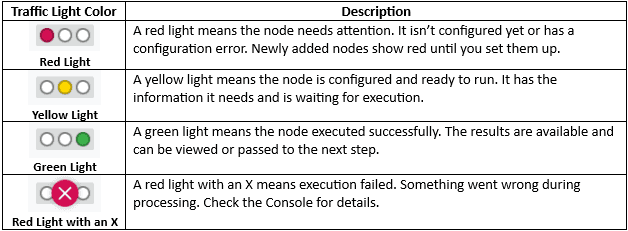
Figure 4.3 — Table of Different Traffic Light status
Sometimes a node shows green status (executed successfully) but with a small warning triangle overlay. This means the node completed its work but encountered non-critical issues. For example, it might have found null values or format inconsistencies that it handled by skipping rows.
Warnings don't stop execution but signal you should investigate. Check the Console panel for yellow warning messages explaining what happened.
The spinning gear or progress indicator appears while a node actively executes. For nodes processing large datasets, this might persist for several seconds or minutes. The progress indicator gives feedback that the node is working
Every node in a KNIME workflow has small connection points called ports. These ports determine what kind of information a node can receive and what it can pass on to the next step. They are the way data, models, database connections, and other objects move through your workflow.
Understanding node ports is essential, because the connections you create between ports define the entire flow of your analysis. Once you learn how to read these ports, you can tell at a glance what a node expects as input and what it will produce as output.
Input and Output Ports
Ports are the small triangular connection points on the sides of nodes. They work like electrical sockets. You plug connections into them to create your data flow.
Input ports appear on the left side of nodes and receive data coming in. Most nodes have one input port, but some have multiple inputs for different purposes. For example, a Joiner node (used to merge two tables) has two input ports with one for each table you want to combine.
Output ports appear on the right side of nodes and send data forward to the next step. After a node processes your data, its output port makes the results available for the next node in the sequence. Some nodes have multiple output ports when they produce different types of results or split data in multiple directions.
The triangular shape of ports points in the direction data flows: input triangles point right (into the node), output triangles point left (out of the node).
Port Shape Conventions: Triangles vs. Squares
You may have noticed that some ports are triangular while others are square. This distinction carries meaning about how those ports handle their data.
Triangular Ports: Data Streams: Triangular ports represent data that flows like a stream from one node to the next. Black triangular ports carrying data tables are the most common example. When you connect triangles, the entire data table passes from the first node to the second, which processes it and produces output through its own output triangle. Triangular ports are active and flowing. Data continuously moves and transforms from left to right across your canvas.
Square Ports: Objects and Resources: Square ports represent objects or resources rather than flowing data streams. Database connections (red squares), models (brown squares), reports (blue squares), and images (green squares) are discrete objects that get passed as complete units rather than streamed and transformed. Think of triangular ports as conveyor belts moving items that get processed at each station, while square ports are like passing a complete tool or finished product. The tool or product is self-contained, not continuously modified.
This distinction helps you understand workflows at a glance. Chains of triangular ports show data transformation pipelines, while square ports indicate that complete objects are being passed around.
Port Multiplicity: Single vs. Multiple Connections
Single Input/Output: Most nodes have one input port and one output port, creating a simple chain where data flows in, gets processed, and flows out. A Row Filter has one black input (receives the table to filter) and one black output (sends the filtered table forward). This represents straightforward, linear transformation.
Multiple Inputs: Some nodes have multiple input ports because they need to combine or compare different data sources. The Joiner node has two input ports for merging tables. The Concatenate node can have multiple inputs to stack several tables together. When you see multiple input ports, think about what data sources that node needs to do its job. A node comparing budget to actuals needs two inputs: budget data and actual data.
Multiple Outputs: Some nodes produce multiple outputs. A Row Splitter has two output ports: one for rows that matched your criteria and one for rows that didn't match. This lets you route different subsets of data down different paths in your workflow. Multiple output ports give you branching capability. Data can flow down multiple paths simultaneously, each applying different transformations, then potentially coming back together later through a join or concatenate operation.
Optional Ports: Some input ports are optional, shown with a dashed triangle outline. The node can execute without these connections, but connecting them enables additional functionality. For example, many writer nodes have an optional red flow variable input at the top. Without it, the node writes to your manually configured file path. With it connected, the node uses a dynamic path, enabling automated file naming like "GL_Report_January_2025.xlsx" without monthly reconfiguration. Optional ports tell you: "This node works without this connection, but you can enhance it by connecting something here." As a beginner, you can typically ignore optional ports until you need their advanced functionality.
Port Colours and What They Mean
KNIME uses several port types to handle specialised data and operations. Understanding these variations helps you recognise what different nodes do and how they fit into more advanced workflows.
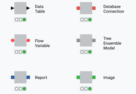
Figure 4.4 — Different Port Types
Data Table Ports (Black Triangle Ports): The node shown with black triangular ports on both sides represents the most common port type in KNIME. These black triangular ports carry data tables with rows and columns, similar to what you see in Excel spreadsheets or database tables. This is the port type you'll use most frequently in financial workflows. When you import general ledger data with Excel Reader, filter transactions with Row Filter, summarise amounts with Group By, or export results with Excel Writer, you're working with black data table ports throughout. The triangular shape points in the direction data flows: input triangles point right (into the node), output triangles point left (out of the node). Nearly every financial workflow consists primarily of nodes connected by black ports, forming a chain of data transformations from raw source data through calculations and filtering to final reports. Understanding black data table ports is fundamental because they handle all your actual financial data as it moves through the workflow.
Database Connection Ports (Red Square Ports): The node shown with red square ports represents a Database Connection node. Unlike triangular black ports that carry actual data tables, these square red ports carry an active connection to a database system like SQL Server, Oracle, or your company's ERP database. Think of this as the difference between having a phone number (the connection) versus having the actual conversation (the data). The Database Connection node establishes the link to your database but doesn't transfer any data yet. You then plug this connection into other database-aware nodes that use it to read or write data. For finance professionals, this is valuable when your financial data lives in databases rather than Excel files. Instead of exporting transactions to Excel first, you connect directly to the database and bring in only the data you need. This is faster, more secure, and keeps you working with current data.
Flow Variable Ports (Red Circle Ports): The node displaying red circular ports on both input and output sides represents Flow Variable operations. Flow variables are special parameters that control how your workflow behaves without carrying actual data tables. These ports always appear at the top of nodes, separate from the main data ports on the sides. Flow variables let you store and pass along values like file paths, date ranges, calculation thresholds, or any other settings that need to change dynamically. For example, instead of hard-coding "January 2025" in multiple places throughout your workflow, you could store "January 2025" as a flow variable at the beginning, then reference that variable throughout your workflow. When February arrives, you change the variable in one place and the entire workflow updates automatically. The red circular ports connect nodes that create, modify, or use these variables. While this is an advanced feature you won't need immediately, flow variables are what transform a single-use workflow into a reusable, automated process that runs month after month with minimal manual intervention.
Tree Ensemble Model Ports (Brown Square Ports) The node with brown square ports represents machine learning model operations, specifically Tree Ensemble Models. These are predictive models that analyse historical patterns to make predictions about future outcomes. In finance, you might use these for forecasting revenue, predicting delinquent accounts receivable, detecting potentially fraudulent transactions, or estimating project costs. The node that trains the model produces a brown output port carrying the trained model. You then connect this to a predictor node that applies the model to new data. While more advanced than basic reporting, these predictive capabilities can add significant value to financial planning and analysis as you grow comfortable with KNIME.
Report Ports (Blue Square Ports): The node showing blue square ports handles Report objects. KNIME's reporting capabilities let you create formatted, professional reports combining data tables, charts, text, and images. These reports can be exported as PDF, Word documents, or HTML files. Report ports carry the report object as it's being built. You might connect multiple data sources and visualisations into a report assembly node, which combines them into a single formatted document. The blue port output connects to a report writer that generates the final file. For finance professionals, this transforms KNIME from a data processing tool into a complete reporting solution. Your workflow can import data, perform calculations, create charts, assemble everything into a formatted report, and save or email it automatically.
Image Ports (Green Square Ports): The node with green square ports carries Image objects. These ports transport actual image files or graphics generated by KNIME nodes. When you create a chart or visualisation in KNIME, that visual output flows through green image ports. This is useful when embedding charts in reports, saving multiple visualisations to separate files, or combining several charts into a dashboard. For example, you might create a budget-versus-actuals bar chart, output it through a green image port, and connect that to a report node that includes the chart in your monthly variance report. Image ports give you control over how visualisations flow through your workflow and where they end up, whether embedded in reports, saved as standalone files, or combined into dashboards.
From our deployments: New users overthink port colours. In 90% of finance workflows, you'll only use black data ports. We typically don't introduce database or model ports until week two of training. Focus on the black triangles first.
5. All About Nodes
Selecting Nodes
Click any individual node to select it and you'll see it highlighted with a blue border and selection handles (small squares) at its corners. To select multiple nodes, click on empty canvas space and drag to create a selection rectangle. All nodes within or touching this rectangle become selected. Alternatively, hold Ctrl (Windows/Linux) or Cmd (macOS) while clicking individual nodes to add them to your selection one at a time.
Once multiple nodes are selected, you can drag them as a group to reorganize your workflow layout. The connections between nodes automatically adjust to maintain proper links as you move things around.
Understanding Node Anatomy and Structure
Every node in KNIME follows a consistent visual design that communicates its purpose, status, and connectivity at a glance.
The Node Body
Figure 4.2 - Anatomy of a node
Each node appears as a coloured rectangular box. The node's name appears prominently at the top, with the node type (like "Excel Reader" or "Row Filter") displayed just below. The background color provides quick visual categorisation: purple/pink nodes typically handle data input and output operations, green nodes perform data manipulation and transformation, blue nodes create visualisations, and yellow nodes manage workflow control structures.
Status Indicators: Understanding the Traffic Lights
The small circular indicator in the bottom-right corner of each node tells you its current state through a simple colour system:
Figure 4.3 — Table of Different Traffic Light status
Sometimes a node shows green status (executed successfully) but with a small warning triangle overlay. This means the node completed its work but encountered non-critical issues. For example, it might have found null values or format inconsistencies that it handled by skipping rows.
Warnings don't stop execution but signal you should investigate. Check the Console panel for yellow warning messages explaining what happened.
The spinning gear or progress indicator appears while a node actively executes. For nodes processing large datasets, this might persist for several seconds or minutes. The progress indicator gives feedback that the node is working
Every node in a KNIME workflow has small connection points called ports. These ports determine what kind of information a node can receive and what it can pass on to the next step. They are the way data, models, database connections, and other objects move through your workflow.
Understanding node ports is essential, because the connections you create between ports define the entire flow of your analysis. Once you learn how to read these ports, you can tell at a glance what a node expects as input and what it will produce as output.
Input and Output Ports
Ports are the small triangular connection points on the sides of nodes. They work like electrical sockets. You plug connections into them to create your data flow.
Input ports appear on the left side of nodes and receive data coming in. Most nodes have one input port, but some have multiple inputs for different purposes. For example, a Joiner node (used to merge two tables) has two input ports with one for each table you want to combine.
Output ports appear on the right side of nodes and send data forward to the next step. After a node processes your data, its output port makes the results available for the next node in the sequence. Some nodes have multiple output ports when they produce different types of results or split data in multiple directions.
The triangular shape of ports points in the direction data flows: input triangles point right (into the node), output triangles point left (out of the node).
Port Shape Conventions: Triangles vs. Squares
You may have noticed that some ports are triangular while others are square. This distinction carries meaning about how those ports handle their data.
Triangular Ports: Data Streams: Triangular ports represent data that flows like a stream from one node to the next. Black triangular ports carrying data tables are the most common example. When you connect triangles, the entire data table passes from the first node to the second, which processes it and produces output through its own output triangle. Triangular ports are active and flowing. Data continuously moves and transforms from left to right across your canvas.
Square Ports: Objects and Resources: Square ports represent objects or resources rather than flowing data streams. Database connections (red squares), models (brown squares), reports (blue squares), and images (green squares) are discrete objects that get passed as complete units rather than streamed and transformed. Think of triangular ports as conveyor belts moving items that get processed at each station, while square ports are like passing a complete tool or finished product. The tool or product is self-contained, not continuously modified.
This distinction helps you understand workflows at a glance. Chains of triangular ports show data transformation pipelines, while square ports indicate that complete objects are being passed around.
Port Multiplicity: Single vs. Multiple Connections
Single Input/Output: Most nodes have one input port and one output port, creating a simple chain where data flows in, gets processed, and flows out. A Row Filter has one black input (receives the table to filter) and one black output (sends the filtered table forward). This represents straightforward, linear transformation.
Multiple Inputs: Some nodes have multiple input ports because they need to combine or compare different data sources. The Joiner node has two input ports for merging tables. The Concatenate node can have multiple inputs to stack several tables together. When you see multiple input ports, think about what data sources that node needs to do its job. A node comparing budget to actuals needs two inputs: budget data and actual data.
Multiple Outputs: Some nodes produce multiple outputs. A Row Splitter has two output ports: one for rows that matched your criteria and one for rows that didn't match. This lets you route different subsets of data down different paths in your workflow. Multiple output ports give you branching capability. Data can flow down multiple paths simultaneously, each applying different transformations, then potentially coming back together later through a join or concatenate operation.
Optional Ports: Some input ports are optional, shown with a dashed triangle outline. The node can execute without these connections, but connecting them enables additional functionality. For example, many writer nodes have an optional red flow variable input at the top. Without it, the node writes to your manually configured file path. With it connected, the node uses a dynamic path, enabling automated file naming like "GL_Report_January_2025.xlsx" without monthly reconfiguration. Optional ports tell you: "This node works without this connection, but you can enhance it by connecting something here." As a beginner, you can typically ignore optional ports until you need their advanced functionality.
Port Colours and What They Mean
KNIME uses several port types to handle specialised data and operations. Understanding these variations helps you recognise what different nodes do and how they fit into more advanced workflows.
Figure 4.4 — Different Port Types
Data Table Ports (Black Triangle Ports): The node shown with black triangular ports on both sides represents the most common port type in KNIME. These black triangular ports carry data tables with rows and columns, similar to what you see in Excel spreadsheets or database tables. This is the port type you'll use most frequently in financial workflows. When you import general ledger data with Excel Reader, filter transactions with Row Filter, summarise amounts with Group By, or export results with Excel Writer, you're working with black data table ports throughout. The triangular shape points in the direction data flows: input triangles point right (into the node), output triangles point left (out of the node). Nearly every financial workflow consists primarily of nodes connected by black ports, forming a chain of data transformations from raw source data through calculations and filtering to final reports. Understanding black data table ports is fundamental because they handle all your actual financial data as it moves through the workflow.
Database Connection Ports (Red Square Ports): The node shown with red square ports represents a Database Connection node. Unlike triangular black ports that carry actual data tables, these square red ports carry an active connection to a database system like SQL Server, Oracle, or your company's ERP database. Think of this as the difference between having a phone number (the connection) versus having the actual conversation (the data). The Database Connection node establishes the link to your database but doesn't transfer any data yet. You then plug this connection into other database-aware nodes that use it to read or write data. For finance professionals, this is valuable when your financial data lives in databases rather than Excel files. Instead of exporting transactions to Excel first, you connect directly to the database and bring in only the data you need. This is faster, more secure, and keeps you working with current data.
Flow Variable Ports (Red Circle Ports): The node displaying red circular ports on both input and output sides represents Flow Variable operations. Flow variables are special parameters that control how your workflow behaves without carrying actual data tables. These ports always appear at the top of nodes, separate from the main data ports on the sides. Flow variables let you store and pass along values like file paths, date ranges, calculation thresholds, or any other settings that need to change dynamically. For example, instead of hard-coding "January 2025" in multiple places throughout your workflow, you could store "January 2025" as a flow variable at the beginning, then reference that variable throughout your workflow. When February arrives, you change the variable in one place and the entire workflow updates automatically. The red circular ports connect nodes that create, modify, or use these variables. While this is an advanced feature you won't need immediately, flow variables are what transform a single-use workflow into a reusable, automated process that runs month after month with minimal manual intervention.
Tree Ensemble Model Ports (Brown Square Ports) The node with brown square ports represents machine learning model operations, specifically Tree Ensemble Models. These are predictive models that analyse historical patterns to make predictions about future outcomes. In finance, you might use these for forecasting revenue, predicting delinquent accounts receivable, detecting potentially fraudulent transactions, or estimating project costs. The node that trains the model produces a brown output port carrying the trained model. You then connect this to a predictor node that applies the model to new data. While more advanced than basic reporting, these predictive capabilities can add significant value to financial planning and analysis as you grow comfortable with KNIME.
Report Ports (Blue Square Ports): The node showing blue square ports handles Report objects. KNIME's reporting capabilities let you create formatted, professional reports combining data tables, charts, text, and images. These reports can be exported as PDF, Word documents, or HTML files. Report ports carry the report object as it's being built. You might connect multiple data sources and visualisations into a report assembly node, which combines them into a single formatted document. The blue port output connects to a report writer that generates the final file. For finance professionals, this transforms KNIME from a data processing tool into a complete reporting solution. Your workflow can import data, perform calculations, create charts, assemble everything into a formatted report, and save or email it automatically.
Image Ports (Green Square Ports): The node with green square ports carries Image objects. These ports transport actual image files or graphics generated by KNIME nodes. When you create a chart or visualisation in KNIME, that visual output flows through green image ports. This is useful when embedding charts in reports, saving multiple visualisations to separate files, or combining several charts into a dashboard. For example, you might create a budget-versus-actuals bar chart, output it through a green image port, and connect that to a report node that includes the chart in your monthly variance report. Image ports give you control over how visualisations flow through your workflow and where they end up, whether embedded in reports, saved as standalone files, or combined into dashboards.
From our deployments: New users overthink port colours. In 90% of finance workflows, you'll only use black data ports. We typically don't introduce database or model ports until week two of training. Focus on the black triangles first.
6. Working with Nodes: The Basics
Select a configured node and press Ctrl+C (Windows/Linux) or Cmd+C (macOS) to copy it. Press Ctrl+V or Cmd+V to paste. The pasted node appears with identical configuration settings, saving configuration time.
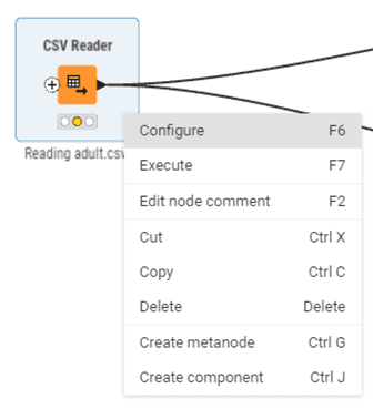
Figure 6.1 — Right clicking a node — Node Context Menu
This is useful when importing multiple similar files or applying the same filter criteria to different datasets.
Replace Nodes
If you need a different node than the one you originally chose, right-click it and look for Replace or Change Node Type. Select the replacement node and KNIME swaps it in place, preserving as many connections and settings as possible.
This is faster than deleting the old node, disconnecting everything, adding the new node, and reconnecting.
Node Description Panel
When you select any node, the Description panel displays detailed documentation about what the node does, its configuration options, inputs, outputs, and often example use cases
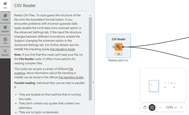
Figure 6.2 — Node Information – Left clicking a node and selecting Info
Before configuring an unfamiliar node, read its description. This saves you from configuration mistakes and helps you understand which settings matter most.
Learning from Example Workflows
When unsure how to accomplish something, look for example workflows on KNIME Hub. Download workflows related to your task (search for "financial reporting" or "Excel import"), and examine how they're built. You can copy techniques, node combinations, and configuration approaches into your own workflows.
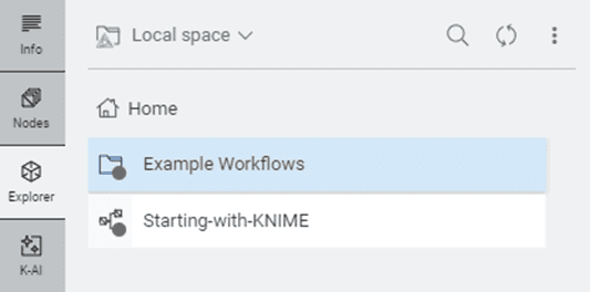
Figure 6.3 — Accessing Example Workflows via the Explorer
The visual nature of KNIME makes learning from examples particularly effective because you can see exactly how data flows and transforms.
By understanding the visual language of nodes, their ports, status indicators, and organisational principles, you've gained the foundation for building sophisticated financial workflows. The Workflow Editor becomes your canvas for transforming manual, repetitive data tasks into automated, documented, reproducible processes that save time, reduce errors, and provide clear audit trails.
6. Working with Nodes: The Basics
Select a configured node and press Ctrl+C (Windows/Linux) or Cmd+C (macOS) to copy it. Press Ctrl+V or Cmd+V to paste. The pasted node appears with identical configuration settings, saving configuration time.
Figure 6.1 — Right clicking a node — Node Context Menu
This is useful when importing multiple similar files or applying the same filter criteria to different datasets.
Replace Nodes
If you need a different node than the one you originally chose, right-click it and look for Replace or Change Node Type. Select the replacement node and KNIME swaps it in place, preserving as many connections and settings as possible.
This is faster than deleting the old node, disconnecting everything, adding the new node, and reconnecting.
Node Description Panel
When you select any node, the Description panel displays detailed documentation about what the node does, its configuration options, inputs, outputs, and often example use cases
Figure 6.2 — Node Information – Left clicking a node and selecting Info
Before configuring an unfamiliar node, read its description. This saves you from configuration mistakes and helps you understand which settings matter most.
Learning from Example Workflows
When unsure how to accomplish something, look for example workflows on KNIME Hub. Download workflows related to your task (search for "financial reporting" or "Excel import"), and examine how they're built. You can copy techniques, node combinations, and configuration approaches into your own workflows.
Figure 6.3 — Accessing Example Workflows via the Explorer
The visual nature of KNIME makes learning from examples particularly effective because you can see exactly how data flows and transforms.
By understanding the visual language of nodes, their ports, status indicators, and organisational principles, you've gained the foundation for building sophisticated financial workflows. The Workflow Editor becomes your canvas for transforming manual, repetitive data tasks into automated, documented, reproducible processes that save time, reduce errors, and provide clear audit trails.
7. Build Your First Workflow (Adding, Connecting, Configuring Nodes)
Once you understand what nodes are and how they communicate through ports, the next step is learning how to work with them. This chapter covers the three core operations you'll perform repeatedly: adding nodes to your canvas, connecting them to create data flow, and configuring them to perform specific tasks.
Adding Nodes to Your Workflow
Every workflow begins by placing nodes on the canvas. KNIME provides several methods for adding nodes.
Drag and Drop from Node Repository
The most straightforward method is dragging nodes directly from the Node Repository panel on the left side of your screen.
Find the node you need using the search box at the top of the Node Repository. Type "excel reader" to import your trial balance export, or "group by" when you need to aggregate transactions by cost centre. KNIME instantly filters the list to show matching nodes.
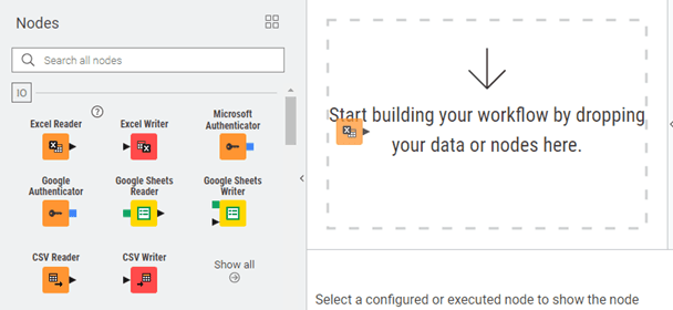
Figure 7.1 — Dragging and Dropping a Node to the Workflow Editor
Click on the node and hold down your mouse button. Drag it to the Workflow Editor canvas in the center of the screen. You'll see a ghost image following your cursor. Position it where you want it, then release the mouse button. The node appears on the canvas with a red status light because it hasn't been configured yet.
This method works well when exploring available nodes or building workflows without a fixed structure in mind.
Quick Node Search
For faster workflow construction, use the quick search feature when you know which nodes you need.
Right-click on empty canvas space. Select Quick Add Node from the context menu. A search dialog opens with a search box.

Figure 7.2 — Quick Add Node Feature
Start typing the node name, like "row filter." KNIME instantly filters available nodes to match your text. Use arrow keys to navigate the results, then press Enter to add the selected node at the position where you right-clicked.
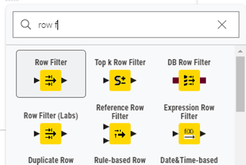
Figure 7.3 — Quick Add Node Search Feature
This keyboard-driven approach is faster once you're familiar with node names. You can stay focused on the canvas without switching between panels.
Node Recommendations and K-AI
KNIME suggests appropriate next steps based on the data you're working with. This feature helps you discover nodes you might not know existed.
After executing a node (green status light), right-click on the editor. Select Quick Add again from the menu.
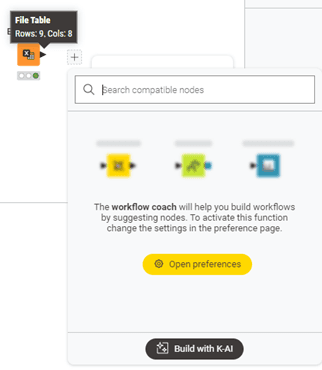
Figure 7.4 — Workflow Coach and K-AI
KNIME analyses the data that node produced and suggests nodes that commonly follow. For example, after executing an Excel Reader with GL data, recommendations might include Row Filter, Group By, or Joiner.
This feature teaches you common workflow patterns by showing what experienced users typically do next in similar situations.
To activate Workflow Coach and K-AI, make sure you are logged in with your KNIME account. Once signed in, you gain access to personalised node recommendations, AI-powered workflow building, and all the features connected to your KNIME Community Hub spaces.
Searching the Node Repository Effectively
The search box at the top of the Node Repository searches node names, descriptions, and tags. You can search by what you want to accomplish rather than exact node names.
For example, searching "sum" returns Group By and Column Aggregator nodes. Searching "missing" returns nodes that handle null values. The search is forgiving of partial matches and typos.
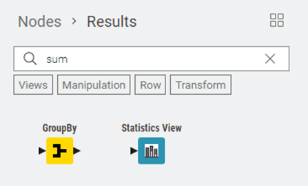
Figure 7.5 — Utilising Node Search
After searching, the Node Repository shows only matching results. Clear the search by deleting your text or clicking the X button to return to the full categorised view.
Connecting Nodes to Create Data Flow
After placing nodes on your canvas, connect them to define how data flows through your analysis. Connections in KNIME are directional arrows that show how data moves from one step to the next.
Creating a Basic Connection
Position your mouse cursor over the output port (triangle on the right side) of the first node. The cursor changes to a crosshair, indicating you're ready to create a connection.
Click on the output port and hold the mouse button. Drag toward the input port (triangle on the left side) of the destination node. A line follows your cursor showing the connection path.
When you hover over a compatible input port, it highlights to indicate it can accept your connection. Release the mouse button to complete the connection.
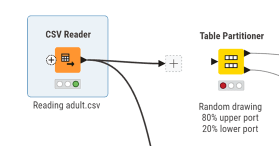
Figure 7.6 —Drag and Drop I/O
KNIME draws an arrow from the first node to the second, showing data flow direction. If both nodes were executed (green status), the connection appears solid, often with green coloring. If either node isn't executed, the connection appears gray.
Understanding Connection Validation
KNIME only lets you connect ports of matching types. Black data table ports connect to black ports, blue database ports connect to blue ports.
If you try to create an incompatible connection, the destination port won't highlight when you hover over it, or the node will display an error status.
This validation guides you toward building logical workflows. If you can't connect two nodes, check their port colours and types. You may need an intermediate node to convert from one type to another.
Connecting to Multiple Input Ports
Some nodes have multiple input ports because they need to combine or compare different data sources.
The Joiner node has two input ports stacked vertically on its left side. The top port receives your first table (perhaps actual results), while the bottom port receives your second table (perhaps budget data). Both connections are required for the node to work.
When connecting to multi-input nodes, pay attention to which port you're connecting to. Hover over an input port to see a tooltip explaining its purpose.
Managing Connection Layout
As workflows grow, connection lines might cross each other, making the flow harder to follow. You can manually adjust connection paths for clarity.
Click on a connection line to select it (it highlights in blue). You'll see small square handles along the line called bendpoints. Click and drag these bendpoints to reshape the connection, routing it around other nodes.
For complex workflows, reorganise node positions. Select and drag nodes to new locations. Their connections automatically stretch and adjust to maintain links. Arrange workflows with clear left-to-right flow so the logic is immediately obvious.
Removing Connections
To delete a connection, right-click on the connection line and select Delete Connection. Alternatively, click the connection to select it, then press Delete.
The connection disappears. If the destination node was previously executed (green), it automatically resets to yellow (configured but not executed) because its input data is no longer available.
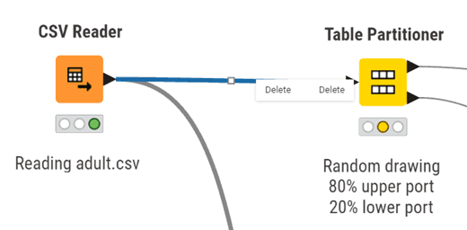
Figure 7.7 — Deleting a node connection
To redirect a connection to a different node, just click and drag from the output port again. KNIME automatically replaces the old connection with the new one.
Configuring Nodes
Configuration tells each node exactly what to do. Every node type has its own settings, but the configuration process follows similar patterns.
Opening the Configuration Dialog
Double-click any node to open its configuration dialog. A window appears showing all settings you can adjust for that node.
Alternatively, right-click the node and select Configure, or select the node and press F6. All three methods open the same window.
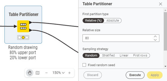
Figure 7.8 — Node Dialog
The dialog stays open until you click OK (saves settings and closes), Cancel (discards changes and closes), or Apply (saves settings but keeps dialog open).
Understanding Configuration Tabs
Most configuration dialogs organise settings into tabs across the top. The first tab contains essential settings, the minimum you need to configure for the node to work.
Additional tabs contain advanced options, performance settings, or specialised features. As a beginner, you can often ignore these tabs and stick with defaults.
Using the Preview Function
Many nodes include a Preview button at the bottom of the configuration dialog. Click it to see a sample of what the node will produce based on your current settings, without actually executing the node.
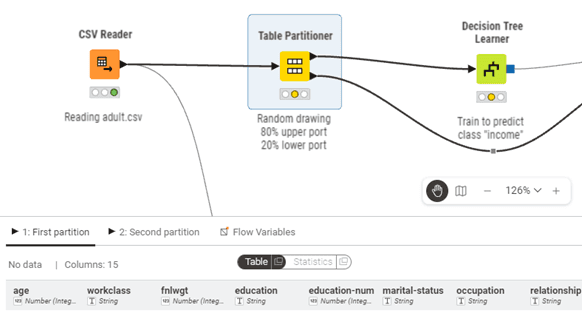
Figure 7.9 — Preview Output of Selected Node
This lets you verify your configuration is correct before committing to full execution. If something looks wrong in the preview, adjust your settings and preview again.
Example: Configuring Excel Reader
Let's walk through configuring the Excel Reader node, your most common starting point for financial workflows.
Double-click the Excel Reader node. The configuration dialog opens. On the main tab, you'll see a file selection section.
Click Browse and navigate to your Excel file (for example, your general ledger export). Select the file and click Open. The file path appears in the configuration dialog.
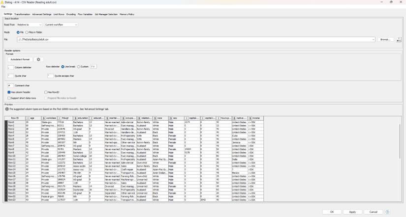
Figure 7.10 — Excel Reader Configuration Dialog Scenario: File selected
Select which sheet to read from the dropdown menu. If your Excel has multiple sheets, choose the one containing your data, often named "GL Export" or "Trial Balance."
Check "Table contains column name headers in row number" if your Excel has column headers in the first row (usually true for finance exports). This tells KNIME to use that row as column names.
If your Excel has title rows or blank rows before actual data starts, use "Skip first data rows" to tell KNIME how many rows to skip.
Click Preview. You should see a table showing the first several rows of your Excel data. Verify that:
Column names appear correctly as headers
Account numbers, amounts, and dates are in the right columns
Data types look correct (numbers show as numbers, not text)
If everything looks good, click OK. The node's status light changes from red (unconfigured) to yellow (configured and ready to execute).
Configuration Best Practices
When configuring nodes for workflows that will be reused or reviewed by others, favor explicit settings over implicit defaults. For example, when parsing dates, explicitly specify the date format pattern rather than relying on automatic detection. This makes workflows more robust and easier for reviewers to understand.
If configuration dialogs include description or notes fields, use them to document your business logic. Explain why you chose particular settings, especially for filtering or calculation nodes.
Flow Variables Tab
Nearly every configuration dialog includes a Flow Variables tab. As a beginner, you can ignore this tab. It's used for advanced automation where configuration settings are controlled by variables rather than fixed values. You'll learn about this in later modules.
Memory Policy Settings
In the Advanced Settings tab (when available), you'll find memory policy options. The default setting keeps processed data in memory for fast access, which works well for most workflows.
For very large datasets (millions of rows), select "Write tables to disk" to reduce memory consumption. This is slightly slower but prevents memory errors when processing large financial datasets.
Your first workflow: Filtering a GL export
Let's say you have an Excel export of 50,000 journal entries and need to find transactions over £10,000 for audit sampling.
Drag in Excel Reader → configure it to point at your file
Connect to Row Filter → set condition: Amount > 10000
Connect to Excel Writer → save your filtered results
Three nodes. What took 20 minutes of Excel filtering now runs in seconds and documents exactly what you did.
Quick Reference: Node Operations
Here's a summary of the most frequent operations:
Adding Nodes - Drag from Node Repository, or right-click canvas and use Add Node search
Configuring - Double-click node, or right-click → Configure, or press F6
Connecting - Click and drag from output port to input port
Disconnecting - Select connection and press Delete, or right-click connection → Delete Connection
Moving - Click and drag node to new position (connections automatically adjust)
Copying - Select node, press Ctrl+C to copy, Ctrl+V to paste (copies configuration too)
Replacing - Right-click node → Replace to swap in a different node type
Node Description - Select node to see detailed documentation in Description panel
Learning from Examples - Browse KNIME Hub for example workflows related to your task
By mastering these three operations (adding, connecting, and configuring nodes), you have the core skills needed to build functional workflows. The visual nature of KNIME makes these operations intuitive, and with practice, you'll build workflows quickly and confidently.
7. Build Your First Workflow (Adding, Connecting, Configuring Nodes)
Once you understand what nodes are and how they communicate through ports, the next step is learning how to work with them. This chapter covers the three core operations you'll perform repeatedly: adding nodes to your canvas, connecting them to create data flow, and configuring them to perform specific tasks.
Adding Nodes to Your Workflow
Every workflow begins by placing nodes on the canvas. KNIME provides several methods for adding nodes.
Drag and Drop from Node Repository
The most straightforward method is dragging nodes directly from the Node Repository panel on the left side of your screen.
Find the node you need using the search box at the top of the Node Repository. Type "excel reader" to import your trial balance export, or "group by" when you need to aggregate transactions by cost centre. KNIME instantly filters the list to show matching nodes.
Figure 7.1 — Dragging and Dropping a Node to the Workflow Editor
Click on the node and hold down your mouse button. Drag it to the Workflow Editor canvas in the center of the screen. You'll see a ghost image following your cursor. Position it where you want it, then release the mouse button. The node appears on the canvas with a red status light because it hasn't been configured yet.
This method works well when exploring available nodes or building workflows without a fixed structure in mind.
Quick Node Search
For faster workflow construction, use the quick search feature when you know which nodes you need.
Right-click on empty canvas space. Select Quick Add Node from the context menu. A search dialog opens with a search box.
Figure 7.2 — Quick Add Node Feature
Start typing the node name, like "row filter." KNIME instantly filters available nodes to match your text. Use arrow keys to navigate the results, then press Enter to add the selected node at the position where you right-clicked.
Figure 7.3 — Quick Add Node Search Feature
This keyboard-driven approach is faster once you're familiar with node names. You can stay focused on the canvas without switching between panels.
Node Recommendations and K-AI
KNIME suggests appropriate next steps based on the data you're working with. This feature helps you discover nodes you might not know existed.
After executing a node (green status light), right-click on the editor. Select Quick Add again from the menu.
Figure 7.4 — Workflow Coach and K-AI
KNIME analyses the data that node produced and suggests nodes that commonly follow. For example, after executing an Excel Reader with GL data, recommendations might include Row Filter, Group By, or Joiner.
This feature teaches you common workflow patterns by showing what experienced users typically do next in similar situations.
To activate Workflow Coach and K-AI, make sure you are logged in with your KNIME account. Once signed in, you gain access to personalised node recommendations, AI-powered workflow building, and all the features connected to your KNIME Community Hub spaces.
Searching the Node Repository Effectively
The search box at the top of the Node Repository searches node names, descriptions, and tags. You can search by what you want to accomplish rather than exact node names.
For example, searching "sum" returns Group By and Column Aggregator nodes. Searching "missing" returns nodes that handle null values. The search is forgiving of partial matches and typos.
Figure 7.5 — Utilising Node Search
After searching, the Node Repository shows only matching results. Clear the search by deleting your text or clicking the X button to return to the full categorised view.
Connecting Nodes to Create Data Flow
After placing nodes on your canvas, connect them to define how data flows through your analysis. Connections in KNIME are directional arrows that show how data moves from one step to the next.
Creating a Basic Connection
Position your mouse cursor over the output port (triangle on the right side) of the first node. The cursor changes to a crosshair, indicating you're ready to create a connection.
Click on the output port and hold the mouse button. Drag toward the input port (triangle on the left side) of the destination node. A line follows your cursor showing the connection path.
When you hover over a compatible input port, it highlights to indicate it can accept your connection. Release the mouse button to complete the connection.
Figure 7.6 —Drag and Drop I/O
KNIME draws an arrow from the first node to the second, showing data flow direction. If both nodes were executed (green status), the connection appears solid, often with green coloring. If either node isn't executed, the connection appears gray.
Understanding Connection Validation
KNIME only lets you connect ports of matching types. Black data table ports connect to black ports, blue database ports connect to blue ports.
If you try to create an incompatible connection, the destination port won't highlight when you hover over it, or the node will display an error status.
This validation guides you toward building logical workflows. If you can't connect two nodes, check their port colours and types. You may need an intermediate node to convert from one type to another.
Connecting to Multiple Input Ports
Some nodes have multiple input ports because they need to combine or compare different data sources.
The Joiner node has two input ports stacked vertically on its left side. The top port receives your first table (perhaps actual results), while the bottom port receives your second table (perhaps budget data). Both connections are required for the node to work.
When connecting to multi-input nodes, pay attention to which port you're connecting to. Hover over an input port to see a tooltip explaining its purpose.
Managing Connection Layout
As workflows grow, connection lines might cross each other, making the flow harder to follow. You can manually adjust connection paths for clarity.
Click on a connection line to select it (it highlights in blue). You'll see small square handles along the line called bendpoints. Click and drag these bendpoints to reshape the connection, routing it around other nodes.
For complex workflows, reorganise node positions. Select and drag nodes to new locations. Their connections automatically stretch and adjust to maintain links. Arrange workflows with clear left-to-right flow so the logic is immediately obvious.
Removing Connections
To delete a connection, right-click on the connection line and select Delete Connection. Alternatively, click the connection to select it, then press Delete.
The connection disappears. If the destination node was previously executed (green), it automatically resets to yellow (configured but not executed) because its input data is no longer available.
Figure 7.7 — Deleting a node connection
To redirect a connection to a different node, just click and drag from the output port again. KNIME automatically replaces the old connection with the new one.
Configuring Nodes
Configuration tells each node exactly what to do. Every node type has its own settings, but the configuration process follows similar patterns.
Opening the Configuration Dialog
Double-click any node to open its configuration dialog. A window appears showing all settings you can adjust for that node.
Alternatively, right-click the node and select Configure, or select the node and press F6. All three methods open the same window.
Figure 7.8 — Node Dialog
The dialog stays open until you click OK (saves settings and closes), Cancel (discards changes and closes), or Apply (saves settings but keeps dialog open).
Understanding Configuration Tabs
Most configuration dialogs organise settings into tabs across the top. The first tab contains essential settings, the minimum you need to configure for the node to work.
Additional tabs contain advanced options, performance settings, or specialised features. As a beginner, you can often ignore these tabs and stick with defaults.
Using the Preview Function
Many nodes include a Preview button at the bottom of the configuration dialog. Click it to see a sample of what the node will produce based on your current settings, without actually executing the node.
Figure 7.9 — Preview Output of Selected Node
This lets you verify your configuration is correct before committing to full execution. If something looks wrong in the preview, adjust your settings and preview again.
Example: Configuring Excel Reader
Let's walk through configuring the Excel Reader node, your most common starting point for financial workflows.
Double-click the Excel Reader node. The configuration dialog opens. On the main tab, you'll see a file selection section.
Click Browse and navigate to your Excel file (for example, your general ledger export). Select the file and click Open. The file path appears in the configuration dialog.
Figure 7.10 — Excel Reader Configuration Dialog Scenario: File selected
Select which sheet to read from the dropdown menu. If your Excel has multiple sheets, choose the one containing your data, often named "GL Export" or "Trial Balance."
Check "Table contains column name headers in row number" if your Excel has column headers in the first row (usually true for finance exports). This tells KNIME to use that row as column names.
If your Excel has title rows or blank rows before actual data starts, use "Skip first data rows" to tell KNIME how many rows to skip.
Click Preview. You should see a table showing the first several rows of your Excel data. Verify that:
Column names appear correctly as headers
Account numbers, amounts, and dates are in the right columns
Data types look correct (numbers show as numbers, not text)
If everything looks good, click OK. The node's status light changes from red (unconfigured) to yellow (configured and ready to execute).
Configuration Best Practices
When configuring nodes for workflows that will be reused or reviewed by others, favor explicit settings over implicit defaults. For example, when parsing dates, explicitly specify the date format pattern rather than relying on automatic detection. This makes workflows more robust and easier for reviewers to understand.
If configuration dialogs include description or notes fields, use them to document your business logic. Explain why you chose particular settings, especially for filtering or calculation nodes.
Flow Variables Tab
Nearly every configuration dialog includes a Flow Variables tab. As a beginner, you can ignore this tab. It's used for advanced automation where configuration settings are controlled by variables rather than fixed values. You'll learn about this in later modules.
Memory Policy Settings
In the Advanced Settings tab (when available), you'll find memory policy options. The default setting keeps processed data in memory for fast access, which works well for most workflows.
For very large datasets (millions of rows), select "Write tables to disk" to reduce memory consumption. This is slightly slower but prevents memory errors when processing large financial datasets.
Your first workflow: Filtering a GL export
Let's say you have an Excel export of 50,000 journal entries and need to find transactions over £10,000 for audit sampling.
Drag in Excel Reader → configure it to point at your file
Connect to Row Filter → set condition: Amount > 10000
Connect to Excel Writer → save your filtered results
Three nodes. What took 20 minutes of Excel filtering now runs in seconds and documents exactly what you did.
Quick Reference: Node Operations
Here's a summary of the most frequent operations:
Adding Nodes - Drag from Node Repository, or right-click canvas and use Add Node search
Configuring - Double-click node, or right-click → Configure, or press F6
Connecting - Click and drag from output port to input port
Disconnecting - Select connection and press Delete, or right-click connection → Delete Connection
Moving - Click and drag node to new position (connections automatically adjust)
Copying - Select node, press Ctrl+C to copy, Ctrl+V to paste (copies configuration too)
Replacing - Right-click node → Replace to swap in a different node type
Node Description - Select node to see detailed documentation in Description panel
Learning from Examples - Browse KNIME Hub for example workflows related to your task
By mastering these three operations (adding, connecting, and configuring nodes), you have the core skills needed to build functional workflows. The visual nature of KNIME makes these operations intuitive, and with practice, you'll build workflows quickly and confidently.
8. KNIME Tables, Joins, & Pivot Tables
This section is a deeper explanation you can come back to. If you just want to get KNIME up and working, you can skim and move on.
Understanding how KNIME handles and displays data is fundamental to effective workflow development. KNIME tables are the primary data structure you'll work with, representing datasets as rows and columns much like spreadsheets or database tables. However, KNIME tables offer far more flexibility and power than traditional spreadsheet tools, supporting diverse data types and enabling sophisticated data manipulation.
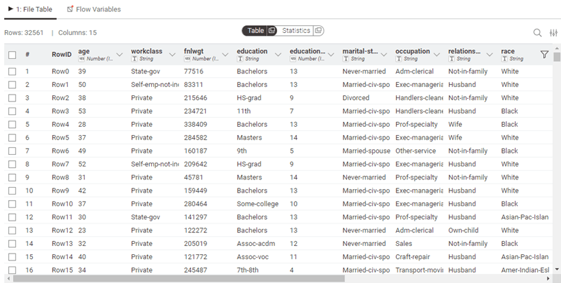
Figure 8.0 — Table Preview/Output
Table Structure and Column Data Types
KNIME tables consist of rows and columns, where each column has a specific data type. Unlike tools such as Excel where a column might contain mixed data types, KNIME enforces type consistency within columns, ensuring data integrity and enabling more reliable analysis. This structured approach prevents many common data quality issues that can plague traditional spreadsheet-based analysis.
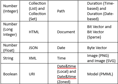
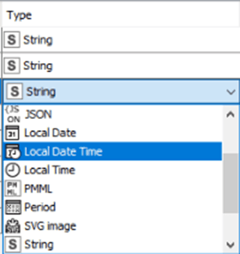
Figure 8.1 — Transform and Change Column Data type in File Reader Node Dialog
The platform supports an extensive range of data types beyond basic strings and numbers. You can work with:
Numeric types: Integers, decimals, and complex numbers for mathematical operations
Text types: Strings of varying lengths, with options for optimized storage
Temporal types: Dates, times, and date-time combinations for chronological analysis
Complex types: Collections (lists within cells), sets, JSON, XML, and even binary data like images and audio
Specialised types: Geospatial data (points, lines, polygons), network graphs, and document types for text mining
This versatility means you can handle virtually any data format your audit or analysis work might require, all within a single workflow.
You can view the data types of each column by switching to the Statistics view in an output table. In this view, numerical columns display their minimum and maximum values, while string columns list the distinct entries found in the data. This makes it easy to check whether each column has been interpreted correctly.
When KNIME reads a file, the reader node assigns data types automatically based on the content it detects. If a column is assigned the wrong type, you can correct it afterward using the available type conversion nodes. Examples include String to Number, Number to String, Double to Int, String to Date&Time, String to JSON, and String to URI.
Some specialised formats are often read as plain strings. In these cases, the Column Type Auto Cast node can automatically convert the columns to the most suitable data types.
If you are using the File Reader node, you can also adjust column types directly within its configuration dialog. Open the Transformation tab (Figure 8.1) and change the type of any column before loading the data into your workflow.
Sorting
Rows in the table view can be sorted temporarily by clicking the ascending or descending arrow that appears when you hover over a column name. This sorting only changes what you see in the preview and does not affect the actual output of the node.
If you want to sort the data permanently, use the Sorter node. To change the order of columns, use the Column Resorter node.
Rendering Columns
In a table view output, you can change how numeric values are displayed. You might choose to show numbers as percentages, display full precision, or use visual styles such as grey scales or bars. To access these options, click the caret icon in the column header and select the renderer you prefer. These changes affect only the table preview and do not modify the actual node output.
For other data types such as JSON, XML, or images, KNIME provides dedicated renderers that help you view the content in a readable form. JSON and XML columns can be expanded or formatted for easier inspection, while image columns display thumbnails directly in the table. As with numeric renderers, these display settings are temporary and do not alter the underlying data.
Table Operations and Transformations
Beyond simply viewing data, you'll frequently need to combine, reshape, and transform tables to support your analysis objectives.
Combining Tables Vertically
The Concatenate node stacks tables vertically, appending rows from multiple tables into a single output. This proves useful when:
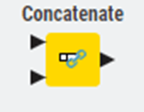
Figure 8.2 — Concatenate Node
Combining data from multiple periods (e.g., quarterly reports into annual analysis)
Merging datasets from different departments or regions
Appending historical data to current records
Concatenate offers options for handling column mismatches:
Union: Keep all columns from all tables (missing values where columns don't match)
Intersection: Keep only columns present in all input tables
Combining Tables Horizontally
The Joiner node combines tables horizontally based on matching values in key columns, similar to database joins or Excel's VLOOKUP but far more powerful. You can specify:
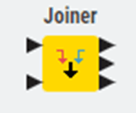
Figure 8.3 — Joiner Node
Join type: Inner, left outer, right outer, or full outer join
Join columns: Which fields to match on (supporting multiple column joins)
Column handling: How to manage duplicate column names
Row filtering: Additional conditions beyond the join keys
For audit applications, joins enable matching transactions with master data, comparing budget to actuals, or reconciling data across systems.
Pivoting and Unpivoting
The Pivot node transforms rows into columns, useful for creating summary tables or cross-tabulations. Conversely, the Unpivot node converts columns back into rows, often necessary when importing data from reports formatted for human reading rather than analysis.
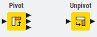
Figure 8.4 — Pivot and Unpivot Nodes
These transformations prove particularly valuable when preparing data for specific visualizations or when reformatting data to match required structures for regulatory reporting.
Storage Management
When a node executes, it often produces a data table at its output port. These tables can range from very small to extremely large, and depending on their size, they may or may not fit comfortably in your computer’s memory. KNIME provides several ways to control how tables are stored, when they remain in memory, and when they are written to disk. This section explains the key options.
In-memory caching
KNIME distinguishes between small and large tables. By default, a table with up to 5000 cells is treated as small, and anything larger is considered large. This threshold can be changed by editing the -Dorg.knime.container.cellsinmemory setting in the knime.ini file. Small tables are kept in memory whenever possible, and only written to disk if memory becomes limited.
Large tables are handled differently. KNIME keeps recently used large tables in memory as long as there is enough available space, but also writes them to disk in the background. This allows KNIME to drop them from memory when they have not been accessed for a while or when memory is needed for other tasks. If you know a node will create a very large table, you can configure that node to skip in-memory caching entirely and write its output directly to disk to reduce memory usage.
Tables written to disk are compressed to save space. By default, KNIME uses Snappy compression. You can switch to GZIP or disable compression through the -Dknime.compress.io setting in the knime.ini file.
Columnar Backend
Beginning with KNIME Analytics Platform 4.3, a new Columnar Backend is available. This backend uses a columnar data structure built on Apache Arrow. It provides faster access patterns for many operations and is designed to improve performance when dealing with large datasets. Setup instructions for using the Columnar Backend can be found in the Table Backend section of the guide.
Table Manipulation Best Practices
As you build workflows that transform and analyze data, following certain practices ensures your tables remain manageable and your workflows perform efficiently.
Column Management
Keeping only the columns you need improves both performance and workflow clarity. Use the Column Filter node regularly to remove unnecessary columns, particularly after joins or data imports that might bring in more fields than required. This practice:
Reduces memory consumption
Speeds up downstream processing
Makes data validation easier
Improves workflow documentation and readability
Row ID Management
Every KNIME table includes a special RowID column (not visible by default in Table View) that uniquely identifies each row. Most of the time, you won't need to interact with RowIDs directly. However, certain operations particularly joins and some machine learning nodes that rely on RowIDs for tracking data.
You can:
View RowIDs by right-clicking a column header and selecting "Show RowID"
Generate new RowIDs using the RowID node
Use existing columns as RowIDs for easier tracking (e.g., using transaction numbers)
Handling Missing Values
Missing data is a reality in most real-world datasets. KNIME represents missing values explicitly, displaying them as question marks (?) in Table View. Unlike some tools where missing values might appear as zeros or empty strings, KNIME's explicit handling ensures you're always aware of data gaps.
The Missing Value node provides several strategies for handling missing data:
Remove rows: Simple but potentially wasteful for sparse datasets
Forward fill: Use the previous valid value (useful for time series)
Column statistics: Replace with mean, median, or mode
Fixed values: Insert specific placeholder values
Linear interpolation: Estimate missing values based on surrounding data
Choose your approach carefully, as different methods can significantly impact your analysis results. For audit work, documenting how you handle missing values becomes part of your working papers and methodology.
File Export Options
Once you've processed your data, you'll need to share results with stakeholders or export data for further use. KNIME provides numerous writer nodes for different output formats:
CSV Writer: Universal format for data exchange
Excel Writer: Preserves formatting for business stakeholders
JSON Writer: Modern format for system integrations
Parquet Writer: Efficient format for big data applications
Database Writers: Direct writes to databases
Choose your format based on your audience and their needs. Business users typically prefer Excel with formatting, whilst technical teams might prefer CSV or JSON for system integration.
Data Apps for Interactive Access
Rather than creating static exports, consider building Data Apps that allow users to interact with data directly. Data Apps provide user-friendly interfaces where stakeholders can:
Upload their own data for analysis
Adjust parameters and rerun analyses
Filter and explore results interactively
Download customized reports
This approach transforms your workflows from one-time analyses into reusable analytical tools that deliver value repeatedly.
Table Documentation and Quality
Maintaining clear documentation about your tables ensures your workflows remain understandable and maintainable over time.
Column Descriptions
KNIME allows adding descriptions to columns, which appear in tooltips and can be exported with your data. Use this feature to document:
Business meaning of each column
Units of measurement
Data source
Transformation logic applied
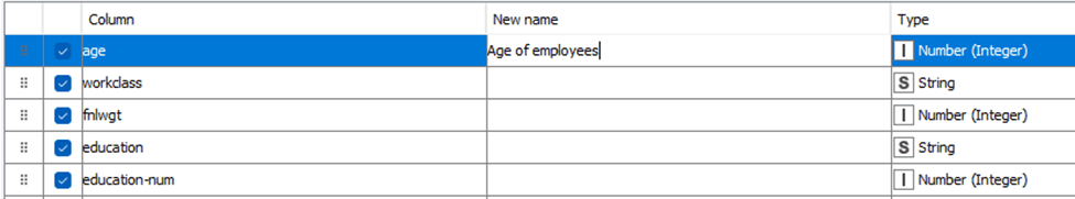
Figure 8.5 — Adding new names and descriptions in Columns
This documentation becomes invaluable when workflows are handed over to colleagues or when you return to a workflow months after creation.
Data Quality Validation
Build data quality checks directly into your workflows using nodes like:
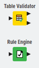
Figure 8.6 — Table Validator and Rule Engine
Table Validator: Ensures tables meet expected structure and content rules
Rule Engine: Flags rows that violate business rules
These validation steps, placed strategically in your workflow, provide assurance that data quality issues are caught early, preventing incorrect analyses from reaching stakeholders.
Understanding KNIME tables, their structure, manipulation, and management form the foundation for effective workflow development. As you build more sophisticated analyses, these fundamentals will serve you well, enabling you to handle increasingly complex data scenarios with confidence.
8. KNIME Tables, Joins, & Pivot Tables
This section is a deeper explanation you can come back to. If you just want to get KNIME up and working, you can skim and move on.
Understanding how KNIME handles and displays data is fundamental to effective workflow development. KNIME tables are the primary data structure you'll work with, representing datasets as rows and columns much like spreadsheets or database tables. However, KNIME tables offer far more flexibility and power than traditional spreadsheet tools, supporting diverse data types and enabling sophisticated data manipulation.
Figure 8.0 — Table Preview/Output
Table Structure and Column Data Types
KNIME tables consist of rows and columns, where each column has a specific data type. Unlike tools such as Excel where a column might contain mixed data types, KNIME enforces type consistency within columns, ensuring data integrity and enabling more reliable analysis. This structured approach prevents many common data quality issues that can plague traditional spreadsheet-based analysis.
Figure 8.1 — Transform and Change Column Data type in File Reader Node Dialog
The platform supports an extensive range of data types beyond basic strings and numbers. You can work with:
Numeric types: Integers, decimals, and complex numbers for mathematical operations
Text types: Strings of varying lengths, with options for optimized storage
Temporal types: Dates, times, and date-time combinations for chronological analysis
Complex types: Collections (lists within cells), sets, JSON, XML, and even binary data like images and audio
Specialised types: Geospatial data (points, lines, polygons), network graphs, and document types for text mining
This versatility means you can handle virtually any data format your audit or analysis work might require, all within a single workflow.
You can view the data types of each column by switching to the Statistics view in an output table. In this view, numerical columns display their minimum and maximum values, while string columns list the distinct entries found in the data. This makes it easy to check whether each column has been interpreted correctly.
When KNIME reads a file, the reader node assigns data types automatically based on the content it detects. If a column is assigned the wrong type, you can correct it afterward using the available type conversion nodes. Examples include String to Number, Number to String, Double to Int, String to Date&Time, String to JSON, and String to URI.
Some specialised formats are often read as plain strings. In these cases, the Column Type Auto Cast node can automatically convert the columns to the most suitable data types.
If you are using the File Reader node, you can also adjust column types directly within its configuration dialog. Open the Transformation tab (Figure 8.1) and change the type of any column before loading the data into your workflow.
Sorting
Rows in the table view can be sorted temporarily by clicking the ascending or descending arrow that appears when you hover over a column name. This sorting only changes what you see in the preview and does not affect the actual output of the node.
If you want to sort the data permanently, use the Sorter node. To change the order of columns, use the Column Resorter node.
Rendering Columns
In a table view output, you can change how numeric values are displayed. You might choose to show numbers as percentages, display full precision, or use visual styles such as grey scales or bars. To access these options, click the caret icon in the column header and select the renderer you prefer. These changes affect only the table preview and do not modify the actual node output.
For other data types such as JSON, XML, or images, KNIME provides dedicated renderers that help you view the content in a readable form. JSON and XML columns can be expanded or formatted for easier inspection, while image columns display thumbnails directly in the table. As with numeric renderers, these display settings are temporary and do not alter the underlying data.
Table Operations and Transformations
Beyond simply viewing data, you'll frequently need to combine, reshape, and transform tables to support your analysis objectives.
Combining Tables Vertically
The Concatenate node stacks tables vertically, appending rows from multiple tables into a single output. This proves useful when:
Figure 8.2 — Concatenate Node
Combining data from multiple periods (e.g., quarterly reports into annual analysis)
Merging datasets from different departments or regions
Appending historical data to current records
Concatenate offers options for handling column mismatches:
Union: Keep all columns from all tables (missing values where columns don't match)
Intersection: Keep only columns present in all input tables
Combining Tables Horizontally
The Joiner node combines tables horizontally based on matching values in key columns, similar to database joins or Excel's VLOOKUP but far more powerful. You can specify:
Figure 8.3 — Joiner Node
Join type: Inner, left outer, right outer, or full outer join
Join columns: Which fields to match on (supporting multiple column joins)
Column handling: How to manage duplicate column names
Row filtering: Additional conditions beyond the join keys
For audit applications, joins enable matching transactions with master data, comparing budget to actuals, or reconciling data across systems.
Pivoting and Unpivoting
The Pivot node transforms rows into columns, useful for creating summary tables or cross-tabulations. Conversely, the Unpivot node converts columns back into rows, often necessary when importing data from reports formatted for human reading rather than analysis.
Figure 8.4 — Pivot and Unpivot Nodes
These transformations prove particularly valuable when preparing data for specific visualizations or when reformatting data to match required structures for regulatory reporting.
Storage Management
When a node executes, it often produces a data table at its output port. These tables can range from very small to extremely large, and depending on their size, they may or may not fit comfortably in your computer’s memory. KNIME provides several ways to control how tables are stored, when they remain in memory, and when they are written to disk. This section explains the key options.
In-memory caching
KNIME distinguishes between small and large tables. By default, a table with up to 5000 cells is treated as small, and anything larger is considered large. This threshold can be changed by editing the -Dorg.knime.container.cellsinmemory setting in the knime.ini file. Small tables are kept in memory whenever possible, and only written to disk if memory becomes limited.
Large tables are handled differently. KNIME keeps recently used large tables in memory as long as there is enough available space, but also writes them to disk in the background. This allows KNIME to drop them from memory when they have not been accessed for a while or when memory is needed for other tasks. If you know a node will create a very large table, you can configure that node to skip in-memory caching entirely and write its output directly to disk to reduce memory usage.
Tables written to disk are compressed to save space. By default, KNIME uses Snappy compression. You can switch to GZIP or disable compression through the -Dknime.compress.io setting in the knime.ini file.
Columnar Backend
Beginning with KNIME Analytics Platform 4.3, a new Columnar Backend is available. This backend uses a columnar data structure built on Apache Arrow. It provides faster access patterns for many operations and is designed to improve performance when dealing with large datasets. Setup instructions for using the Columnar Backend can be found in the Table Backend section of the guide.
Table Manipulation Best Practices
As you build workflows that transform and analyze data, following certain practices ensures your tables remain manageable and your workflows perform efficiently.
Column Management
Keeping only the columns you need improves both performance and workflow clarity. Use the Column Filter node regularly to remove unnecessary columns, particularly after joins or data imports that might bring in more fields than required. This practice:
Reduces memory consumption
Speeds up downstream processing
Makes data validation easier
Improves workflow documentation and readability
Row ID Management
Every KNIME table includes a special RowID column (not visible by default in Table View) that uniquely identifies each row. Most of the time, you won't need to interact with RowIDs directly. However, certain operations particularly joins and some machine learning nodes that rely on RowIDs for tracking data.
You can:
View RowIDs by right-clicking a column header and selecting "Show RowID"
Generate new RowIDs using the RowID node
Use existing columns as RowIDs for easier tracking (e.g., using transaction numbers)
Handling Missing Values
Missing data is a reality in most real-world datasets. KNIME represents missing values explicitly, displaying them as question marks (?) in Table View. Unlike some tools where missing values might appear as zeros or empty strings, KNIME's explicit handling ensures you're always aware of data gaps.
The Missing Value node provides several strategies for handling missing data:
Remove rows: Simple but potentially wasteful for sparse datasets
Forward fill: Use the previous valid value (useful for time series)
Column statistics: Replace with mean, median, or mode
Fixed values: Insert specific placeholder values
Linear interpolation: Estimate missing values based on surrounding data
Choose your approach carefully, as different methods can significantly impact your analysis results. For audit work, documenting how you handle missing values becomes part of your working papers and methodology.
File Export Options
Once you've processed your data, you'll need to share results with stakeholders or export data for further use. KNIME provides numerous writer nodes for different output formats:
CSV Writer: Universal format for data exchange
Excel Writer: Preserves formatting for business stakeholders
JSON Writer: Modern format for system integrations
Parquet Writer: Efficient format for big data applications
Database Writers: Direct writes to databases
Choose your format based on your audience and their needs. Business users typically prefer Excel with formatting, whilst technical teams might prefer CSV or JSON for system integration.
Data Apps for Interactive Access
Rather than creating static exports, consider building Data Apps that allow users to interact with data directly. Data Apps provide user-friendly interfaces where stakeholders can:
Upload their own data for analysis
Adjust parameters and rerun analyses
Filter and explore results interactively
Download customized reports
This approach transforms your workflows from one-time analyses into reusable analytical tools that deliver value repeatedly.
Table Documentation and Quality
Maintaining clear documentation about your tables ensures your workflows remain understandable and maintainable over time.
Column Descriptions
KNIME allows adding descriptions to columns, which appear in tooltips and can be exported with your data. Use this feature to document:
Business meaning of each column
Units of measurement
Data source
Transformation logic applied
Figure 8.5 — Adding new names and descriptions in Columns
This documentation becomes invaluable when workflows are handed over to colleagues or when you return to a workflow months after creation.
Data Quality Validation
Build data quality checks directly into your workflows using nodes like:
Figure 8.6 — Table Validator and Rule Engine
Table Validator: Ensures tables meet expected structure and content rules
Rule Engine: Flags rows that violate business rules
These validation steps, placed strategically in your workflow, provide assurance that data quality issues are caught early, preventing incorrect analyses from reaching stakeholders.
Understanding KNIME tables, their structure, manipulation, and management form the foundation for effective workflow development. As you build more sophisticated analyses, these fundamentals will serve you well, enabling you to handle increasingly complex data scenarios with confidence.
9. Workflow States, Log Management, and Key Shortcuts
Node Reset and Workflow Execution
When you reset a node, its status moves from “executed” back to “configured,” and its output data is cleared. Saving a workflow in an executed state means KNIME also saves all data produced by the nodes. This can significantly increase file size, especially when working with large datasets. For this reason, it is best practice to reset workflows before saving them when the underlying data is easy to access again. A reset workflow stores only the node configurations, not the generated results.
KNIME Log and Node Operations
Resetting a node does not undo any of the actions that have happened in the workflow. All configuration steps, executions, errors, and warnings are recorded in the KNIME log. This log is stored in a file named knime.log. You can open it from the menu by selecting Show KNIME log in File Explorer. In the classic user interface, it is located under View > Open KNIME log. The file itself is stored in the workspace under <knime-workspace>/.metadata/knime/knime.log.
Logging
In addition to the main knime.log file, KNIME writes log messages to several other destinations. Some of these targets are not files at all; they stream their output directly to a terminal or console. Each log file has a maximum size limit. Once it reaches that limit, KNIME automatically rotates the file by creating a new one and compressing the older file into an archive. This ensures that logs remain readable, organised, and do not consume unnecessary disk space.
Logging Targets
Logging targets are the different places where KNIME sends its log messages. Each target receives certain types of messages and serves a different purpose. When something happens in KNIME, such as a workflow execution, a node error, or a system event, that information is written to one or more logging targets so you can review it later or monitor it in real time.
In simple terms, logging targets are the destinations where KNIME stores or displays its diagnostic information. Some targets write to files in your workspace so you can check them afterward. Others stream messages directly to a terminal or to the Console view in the UI. Each target helps you understand what KNIME is doing behind the scenes and is especially useful for debugging workflows, troubleshooting errors, or monitoring automated processes.
KNIME Analytics Platform writes log messages to several different targets, each serving its own purpose. Understanding these targets helps you know where to look when something goes wrong or when you need more detail about what happened during workflow execution.
The main KNIME log file, named knime.log, is stored inside your workspace under .metadata/knime/knime.log. This file collects messages from the platform and from every node you execute. It records workflow events, configuration steps, warnings, and errors. By default, it can grow up to 10 MB before KNIME rotates it, creating a fresh file and compressing the previous one. If you need a different size limit, you can adjust it using the -Dknime.logfile.maxsize=<size> setting in the knime.ini file. The log level for this target is controlled through the logging.loglevel.logfile preference.
Each workflow also has its own per-workflow log file, stored inside the workflow folder as knime.log. This file contains only the messages related to that specific workflow, making it useful when you want to isolate issues without searching through the global log. Like the main log, it uses a 10 MB limit and follows the same rotation rules.
KNIME also writes messages to the Platform log, stored in .metadata/.log in your workspace. This file records events coming from the underlying Eclipse platform, such as issues during extension installation. Unlike the other logs, the Platform log does not have a size limit and cannot be configured from the KNIME preferences.
If you launched KNIME from a terminal, you will see logs streamed directly to the standard output. This live feed is especially useful in headless deployments or when running KNIME inside containers. The log level for this stream can be controlled through logging.loglevel.stdout. A similar stream exists for standard error output, but its log level cannot be changed through preferences.
Finally, in the Classic UI, KNIME provides a Console view that displays log messages directly within the application. This output behaves similarly to standard output but allows you to view messages without opening a terminal. Its log level can be adjusted using the logging.loglevel.console preference.
If you choose to adjust log file size limits, remember to set the -Dknime.logfile.maxsize property inside knime.ini, placed after the command-line arguments. This ensures KNIME applies the correct limits the next time it starts.
For more advanced setups, you can view the available logging targets directly from within KNIME. This includes adjusting log levels, viewing live console output, and accessing the local log files through the menu. These tools give you greater control over how KNIME records and reports activity, which is particularly helpful when working in complex or automated environments.
Key Shortcuts
Efficiency in KNIME comes not just from building elegant workflows, but from working smoothly within the interface itself. KNIME offers extensive keyboard shortcuts and configuration options that, once mastered, dramatically accelerate workflow development. This chapter explores how to customise KNIME to match your working style and leverage shortcuts to work more efficiently.
The Philosophy of Shortcuts
Before diving into specific shortcuts, it's worth understanding why they matter. When building workflows, you'll perform certain actions repeatedly: adding nodes, connecting them, executing workflows, viewing results. Each time you reach for your mouse, navigate menus, and click through options, you interrupt your flow of thought. Keyboard shortcuts eliminate these interruptions, keeping you focused on the analytical logic rather than interface mechanics.
Moreover, shortcuts reveal power features you might not discover through menus alone. Many of KNIME's most useful capabilities like quick node insertion or connection shortcuts, are primarily accessed through keyboard commands.
General Actions
Action | macOS | Windows & Linux |
|---|---|---|
Close workflow | ⌘ W | Ctrl + W |
Create workflow | ⌘ N | Ctrl + N |
Switch to next workflow | ⌘ ⇥ | Ctrl + Tab |
Switch to previous workflow | ⌘ ⇧ ⇥ | Ctrl + Shift + Tab |
Save | ⌘ S | Ctrl + S |
Undo | ⌘ Z | Ctrl + Z |
Redo | ⌘ ⇧ Z | Ctrl + Shift + Z |
Delete | ⌫ | Delete |
Copy | ⌘ C | Ctrl + C |
Cut | ⌘ X | Ctrl + X |
Paste | ⌘ V | Ctrl + V |
Export | ⌘ E | Ctrl + E |
Select all | ⌘ A | Ctrl + A |
Deselect all | ⌘ ⇧ A | Ctrl + Shift + A |
Copy table cells | ⌘ C | Ctrl + C |
Copy cells + header | ⌘ ⇧ C | Ctrl + Shift + C |
Activate filter input field | ⌘ ⇧ F | Ctrl + Shift + F |
Close dialog without saving | Esc | Esc |
Execution Shortcuts
Action | macOS | Windows & Linux |
|---|---|---|
Configure | F6 | F6 |
Configure flow variables | ⇧ F6 | Shift + F6 |
Execute | F7 | F7 |
Execute all | ⇧ F7 | Shift + F7 |
Reset | F8 | F8 |
Reset all | ⇧ F8 | Shift + F8 |
Cancel | F9 | F9 |
Cancel all | ⇧ F9 | Shift + F9 |
Open view | F10 | F10 |
Close dialog & execute node | ⌘ ↩ | Ctrl + ↵ |
Resume loop | ⌘ ⌥ F8 | Ctrl + Alt + F8 |
Pause loop | ⌘ ⌥ F7 | Ctrl + Alt + F7 |
Step loop | ⌘ ⌥ F6 | Ctrl + Alt + F6 |
Selected Node Actions
Action | macOS | Windows & Linux |
|---|---|---|
Activate nth output port view | ⇧ 1–9 | Shift + 1–9 |
Activate flow variable view | ⇧ 0 | Shift + 0 |
Detach nth output port view | ⇧ ⌥ 1–9 | Shift + Alt + 1–9 |
Detach variable view | ⇧ ⌥ 0 | Shift + Alt + 0 |
Detach active output port view | ⇧ ⌥ ↩ | Shift + Alt + ↵ |
Edit node comment | F2 | F2 |
Select next port | ⌃ P | Alt + P |
Move port selection | Arrow keys | Arrow keys |
Apply label & leave edit mode | ⌘ ↩ | Ctrl + ↵ |
Workflow Annotations
Action | macOS | Windows & Linux |
|---|---|---|
Edit annotation | F2 | F2 |
Bring to front | ⌘ ⇧ PageUp | Ctrl + Shift + PageUp |
Bring forward | ⌘ PageUp | Ctrl + PageUp |
Send backward | ⌘ PageDown | Ctrl + PageDown |
Send to back | ⌘ ⇧ PageDown | Ctrl + Shift + PageDown |
Normal text | ⌘ 0 | Ctrl + Alt + 0 |
Headings (1–6) | ⌘ ⌥ 1–6 | Ctrl + Alt + 1–6 |
Bold | ⌘ B | Ctrl + B |
Italic | ⌘ I | Ctrl + I |
Underline | ⌘ U | Ctrl + U |
Strikethrough | ⌘ ⇧ S | Ctrl + Shift + S |
Ordered list | ⌘ ⇧ 7 | Ctrl + Shift + 7 |
Bullet list | ⌘ ⇧ 8 | Ctrl + Shift + 8 |
Add or edit link | ⌘ K | Ctrl + K |
Resize annotation (height/width) | ⌥ + Arrows | Alt + Arrows |
Workflow Editor Modes
Mode | macOS | Windows & Linux |
|---|---|---|
Selection mode | V | V |
Pan mode | P | P |
Annotation mode | T | T |
Leave mode | Esc | Esc |
Workflow Editor Actions
Action | macOS | Windows & Linux |
|---|---|---|
Quick add node | ⌘ . | Ctrl + . |
Connect nodes | ⌘ L | Ctrl + L |
Connect using flow variable ports | ⌘ K | Ctrl + K |
Disconnect nodes | ⌘ ⇧ L | Ctrl + Shift + L |
Disconnect flow variable connections | ⌘ ⇧ K | Ctrl + Shift + K |
Select node in quick add panel | Arrow keys | Arrow keys |
Add node from quick panel | ↩ | ↵ |
Component & Metanode Building
Action | macOS | Windows & Linux |
|---|---|---|
Create metanode | ⌘ G | Ctrl + G |
Create component | ⌘ J | Ctrl + J |
Expand metanode | ⌘ ⇧ G | Ctrl + Shift + G |
Expand component | ⌘ ⇧ J | Ctrl + Shift + J |
Rename component/metanode | ⇧ F2 | Shift + F2 |
Open component/metanode | ⌘ ⌥ ↩ | Ctrl + Alt + ↵ |
Open parent workflow | ⌘ ⌥ ⇧ ↩ | Ctrl + Alt + Shift + ↵ |
Open layout editor | ⌘ D | Ctrl + D |
Open layout editor for selected | ⌘ ⇧ D | Ctrl + Shift + D |
Zooming, Panning, Navigation
Action | macOS | Windows & Linux |
|---|---|---|
Fit to screen | ⌘ 2 | Ctrl + 2 |
Fill entire screen | ⌘ 1 | Ctrl + 1 |
Zoom in | ⌘ + | Ctrl + + |
Zoom out | ⌘ - | Ctrl + - |
Zoom to 100% | ⌘ 0 | Ctrl + 0 |
Pan | Space + drag | Space + drag |
Panel Navigation
Action | macOS | Windows & Linux |
|---|---|---|
Show or hide side panel | ⌘ P | Ctrl + P |
Other Shortcuts
Action | macOS | Windows & Linux |
|---|---|---|
Reset interface scale | ⌘ ⌥ 0 | Ctrl + Alt + 0 |
Closing Thoughts on Shortcuts
In the Modern UI, shortcuts are built into KNIME and remain consistent across all installations. Even when you add extensions, the core shortcuts stay the same, which helps you work with confidence as your setup grows.
As you continue using KNIME, these shortcuts will feel increasingly natural. What may seem like a long list now will soon become familiar movements that let you stay focused on your analysis rather than the interface. The small effort you invest in learning them quickly pays off by making your workflow development smoother and more efficient.
10. What's Next?
You now understand KNIME's interface, how nodes connect, and how data flows through a workflow. From here:
Read the book: KNIME for Auditors goes deeper into practical workflows for audit and finance teams.
Practice: Download KNIME and rebuild a manual Excel process as a workflow.
Get training: We run online KNIME training for finance and audit teams, and deliver in-house programmes for firms like Verizon. We also lead open training courses hosted by KNIME, with participants joining from across the world.
Go further with AI: Once you're comfortable with KNIME, we can help you explore what's possible with AI - from document processing to predictive analytics. Get in touch to discuss.
Explore: Browse the KNIME Hub for example workflows you can download and adapt.
On This Page:
On This Page:
On This Page:
Continue Learning
Join Our Mailing List
Join Our Mailing List
Join Our Mailing List
The Innovation Experts
Our Offices
Get in Touch

© 2025 Bloch AI
The Innovation Experts
Our Offices
Get in Touch
© 2025 Bloch AI
The Innovation Experts
Our Offices
Get in Touch
© 2025 Bloch AI